CASE STUDY
VISUAL IDENTITY & WEB DESIGN FOR MEDIA & COMMUNICATIONS AGENCY
About the
project.
-
DELIVERABLESBranding, social media graphics, infographics, stationery, presentation design.
-
YEAR2022/23
OVERVIEW
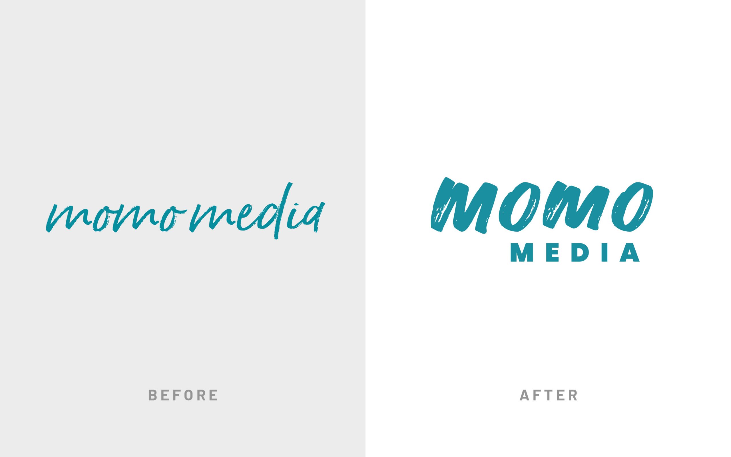
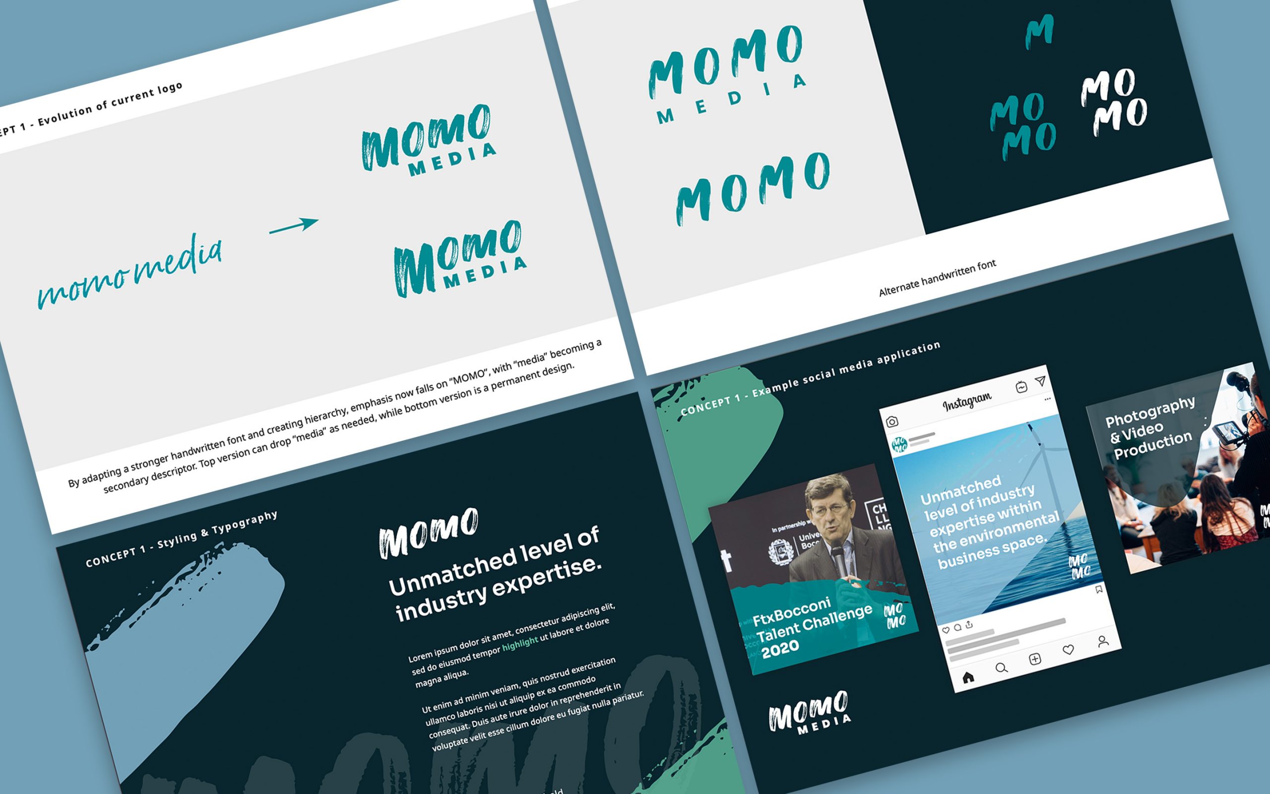
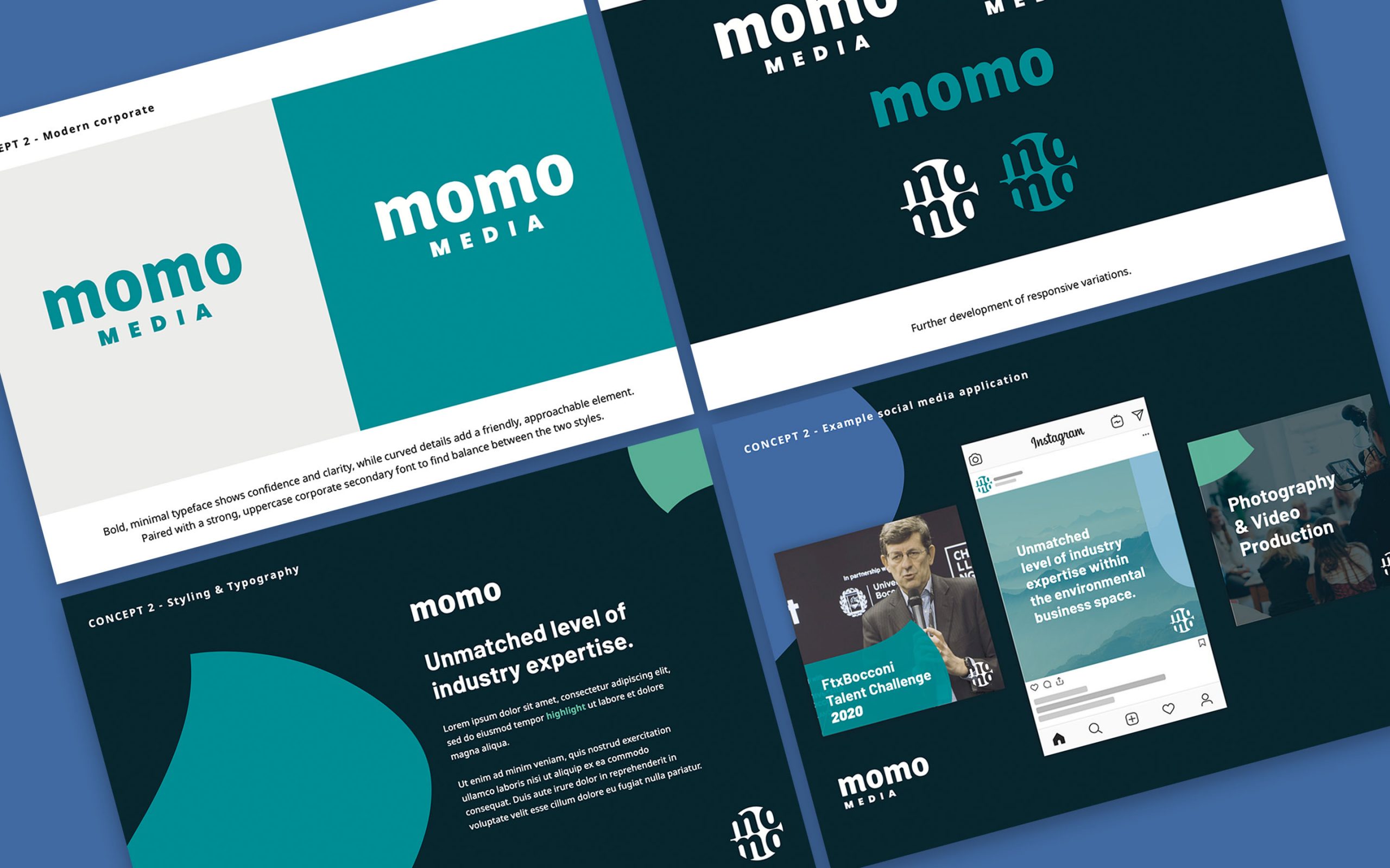
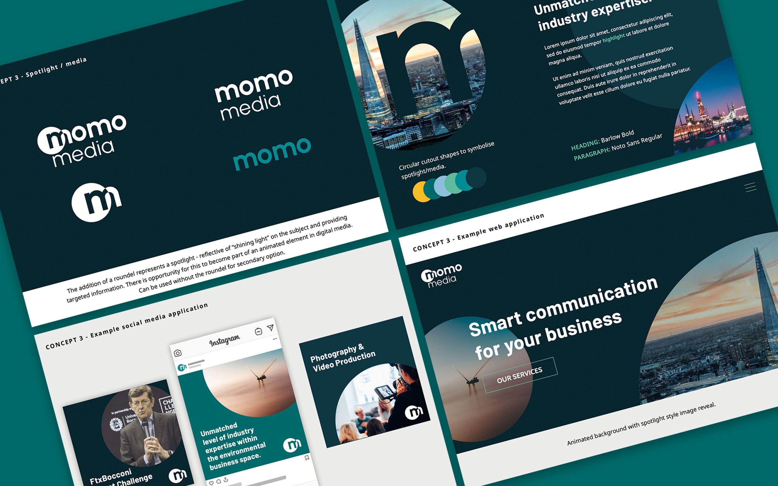
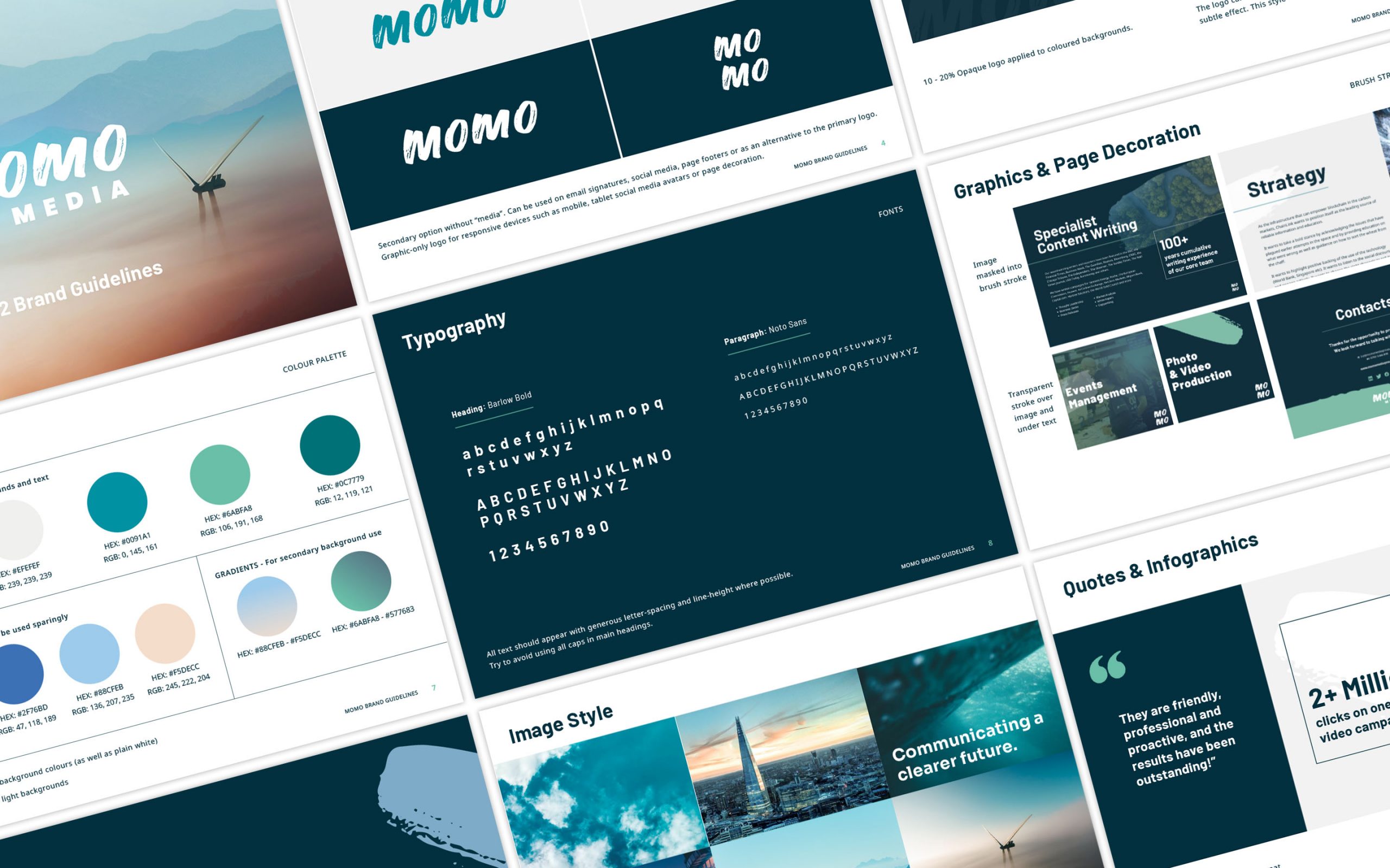
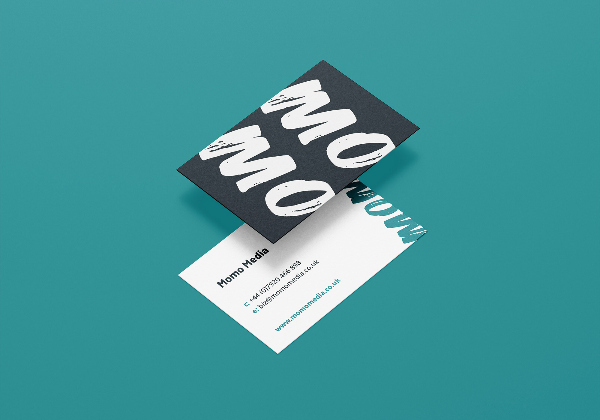
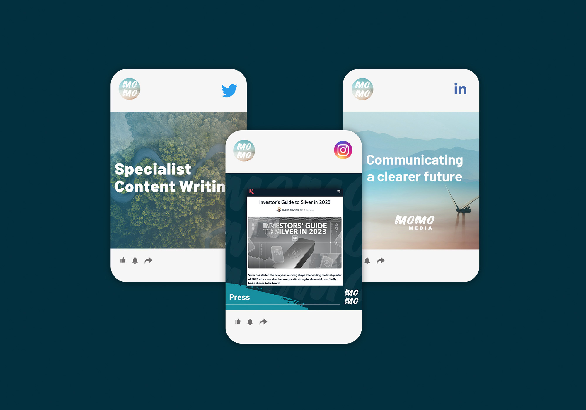
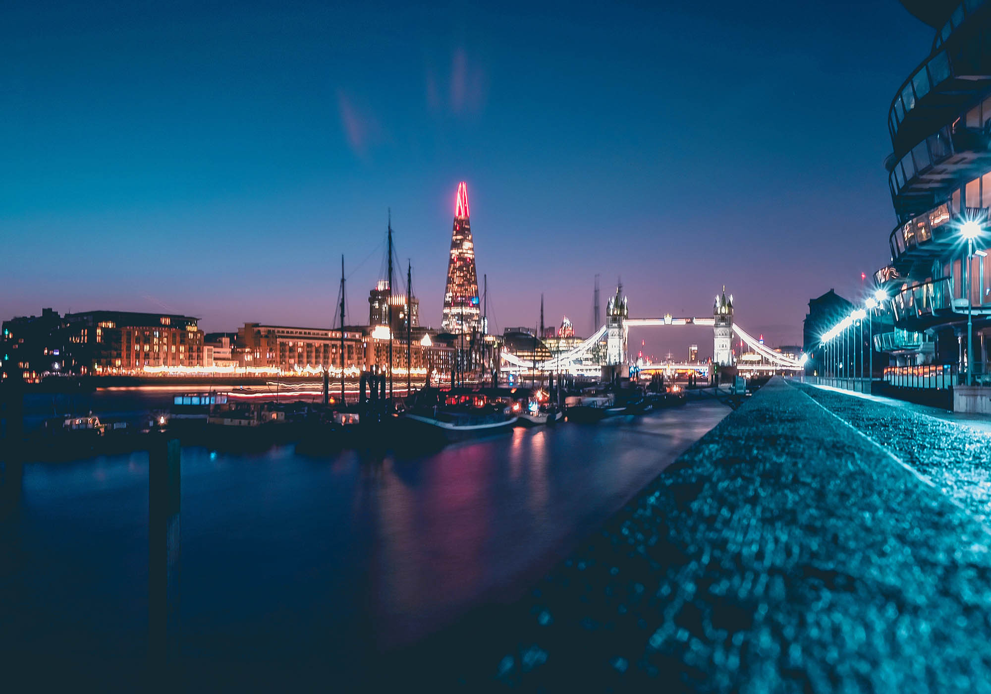
The client required a brand refresh to enhance their corporate offering and focus on sustainability and the renewable energy sector, without losing their friendly, approachable style.
The logo was to remain typographic, authentic and handwritten, so a bolder, more modern typeface was developed to balance all needs.
The original bright blue colour palette was softened by the addition of warm, friendly accents, while a dark navy blue was added to complete the corporate aspect.
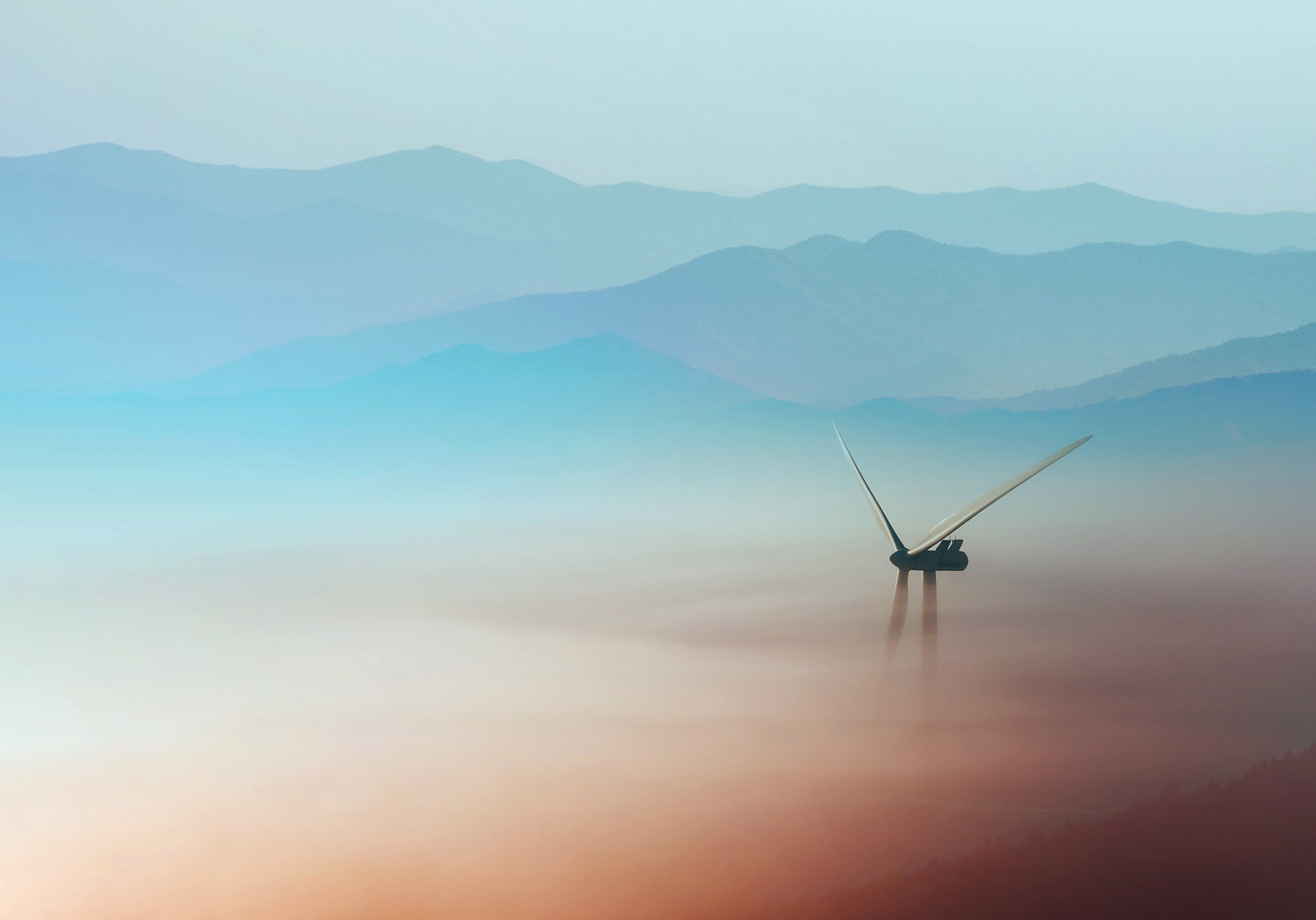
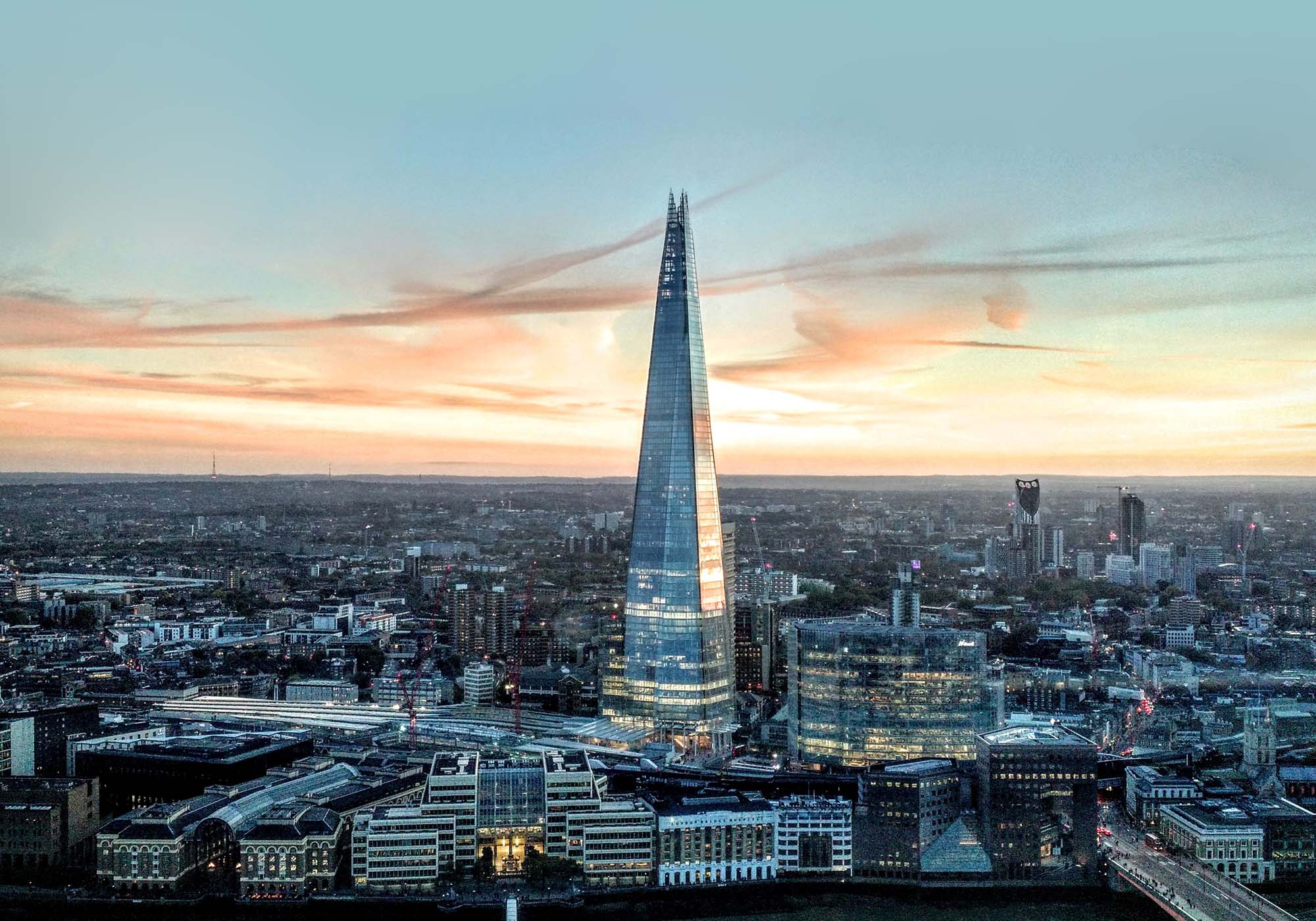
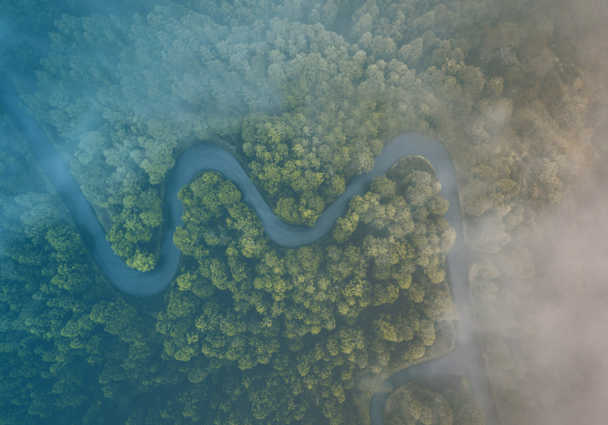
A new image style was created, focusing on softer photography relating to sustainability and the environment.
Brand
Guidelines.
Presentation
Design.


Brand
Development.