
CASE STUDY
BRAND REFRESH FOR PENSIONS LAW FIRM
About the
project.
-
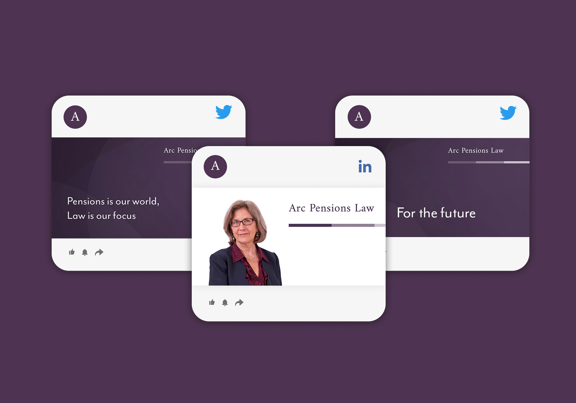
DELIVERABLESBranding, web design, stationery, social media assets.
-
YEAR2019
OVERVIEW
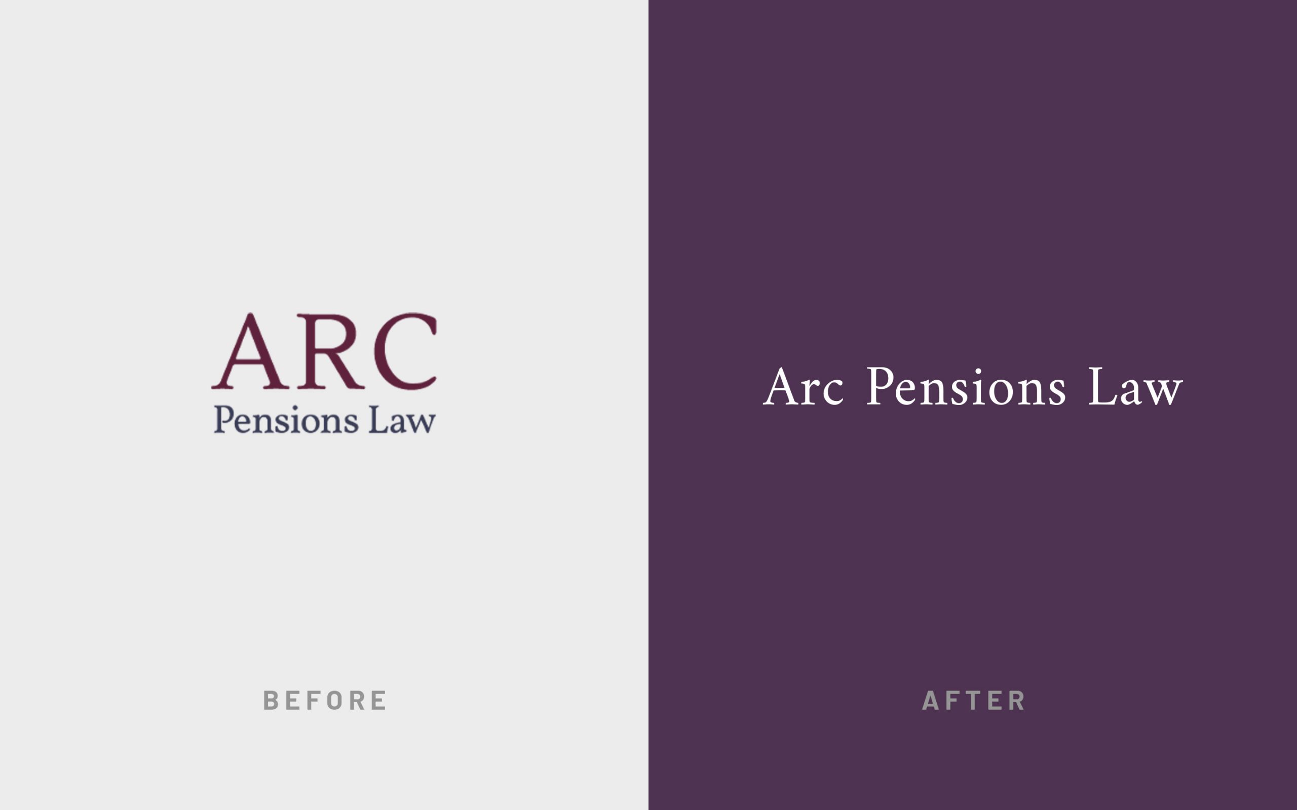
The client was in need of a brand refresh to match the fast-growing success of the London firm. The logo was redesigned to appear more sophisticated and to move away from the “ARC” acronym branding of their original name.
The established brand colour palette was updated to incorporate more elegant shades of purple with additional complementary accents. Subtle arc shapes were introduced for added depth and texture in order to reduce the use of generic law firm imagery. Deliverables included a set of new brand guidelines, website redesign, stationery and social media assets.
Brand
Evolution.
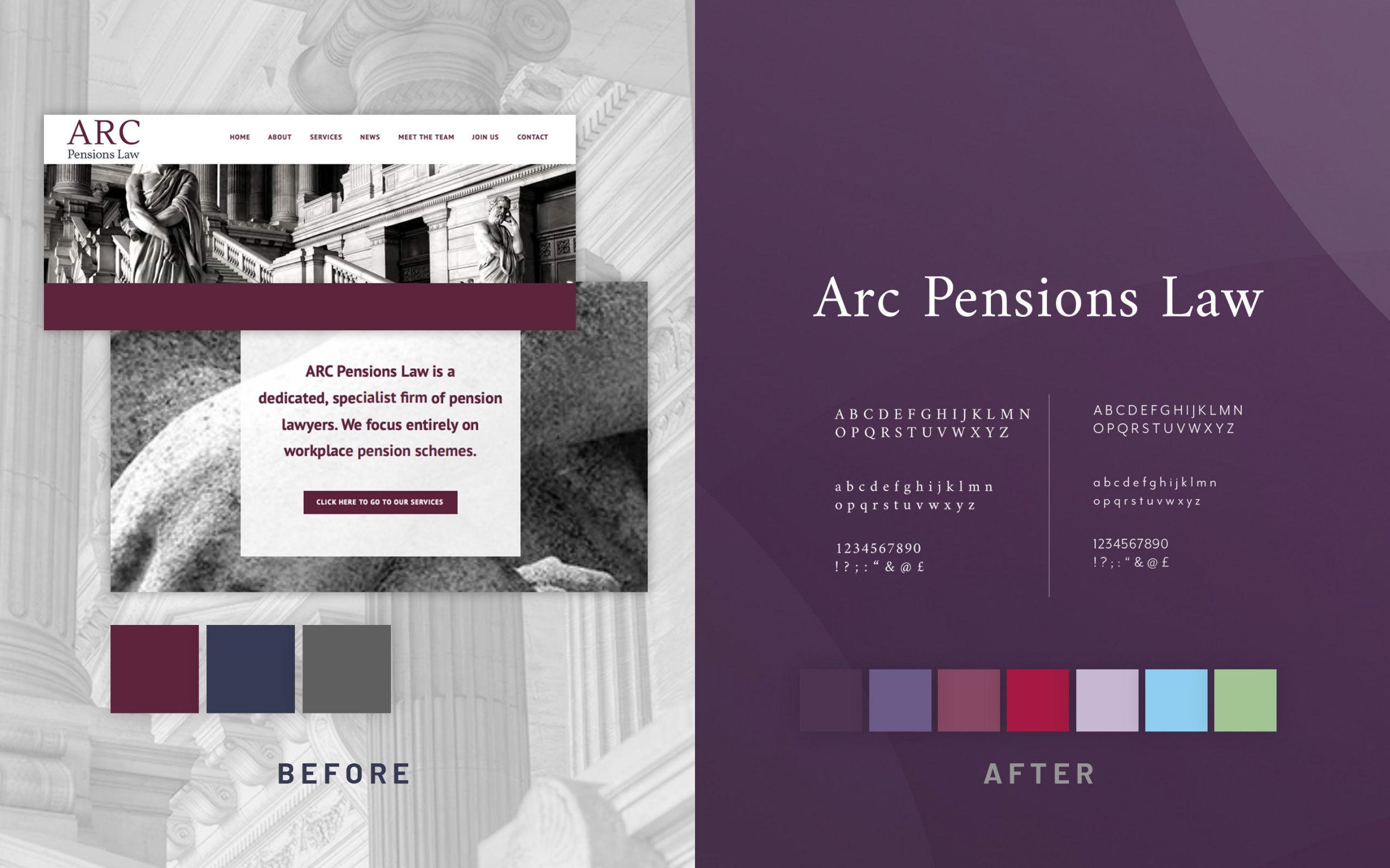
Brand
Guidelines.

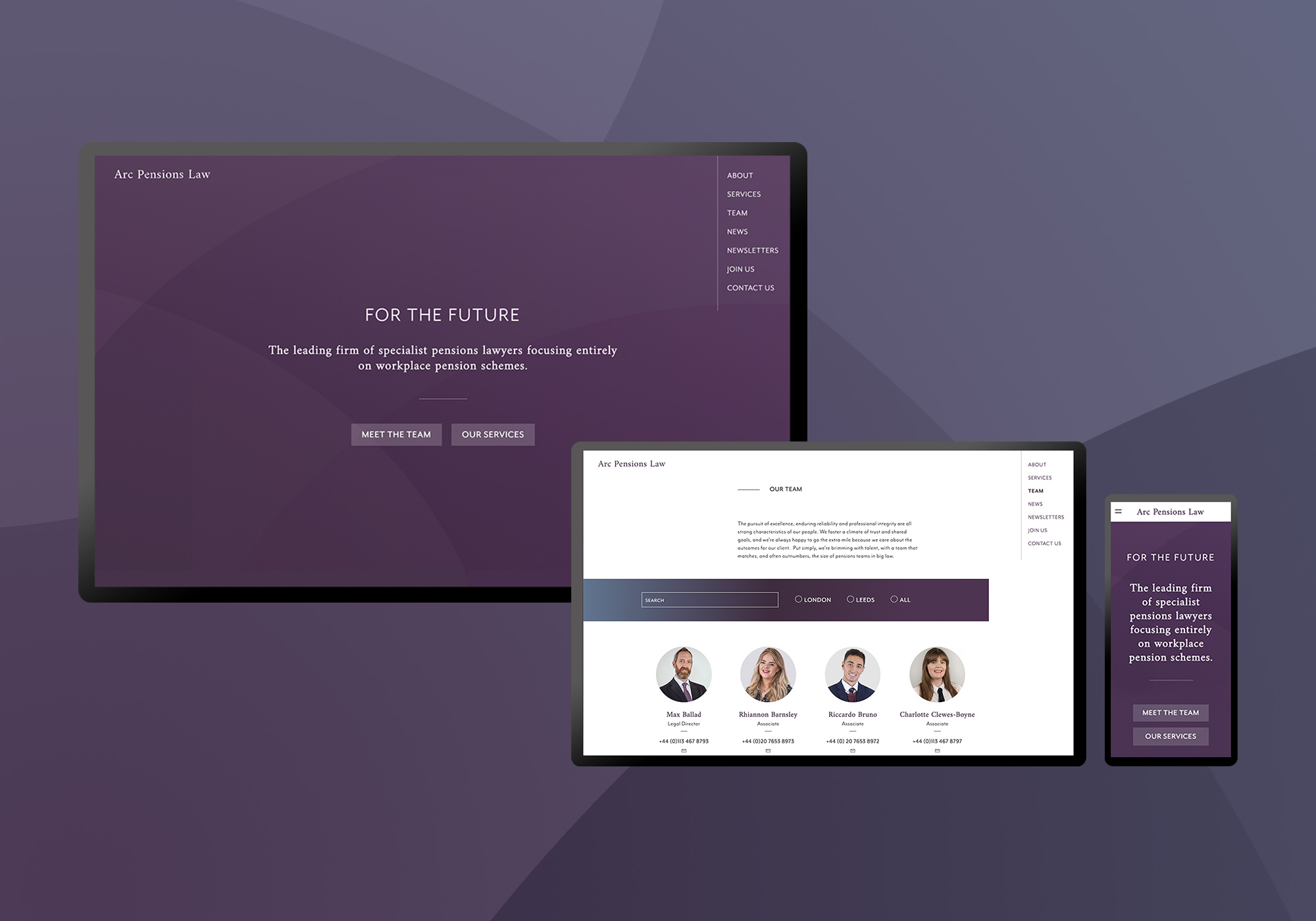
Website
Design.
Social media assets.