CASE STUDY
BRAND REFRESH FOR INTERNATIONAL AWARD FOUNDATION
About the
project.
-
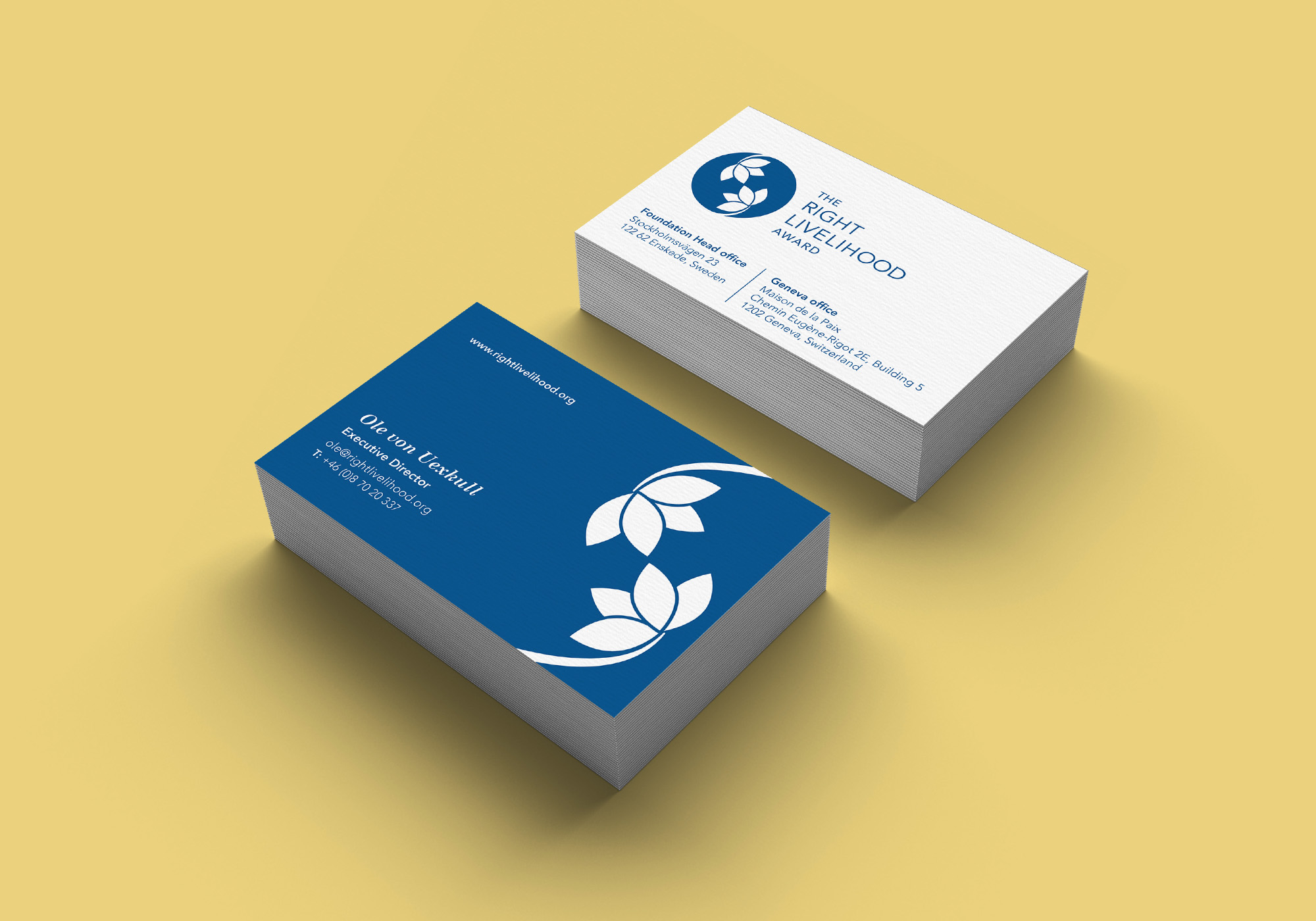
DELIVERABLESBranding, infographics, stationery, event materials, social media, marketing materials, signage.
-
YEAR2016-2020
OVERVIEW
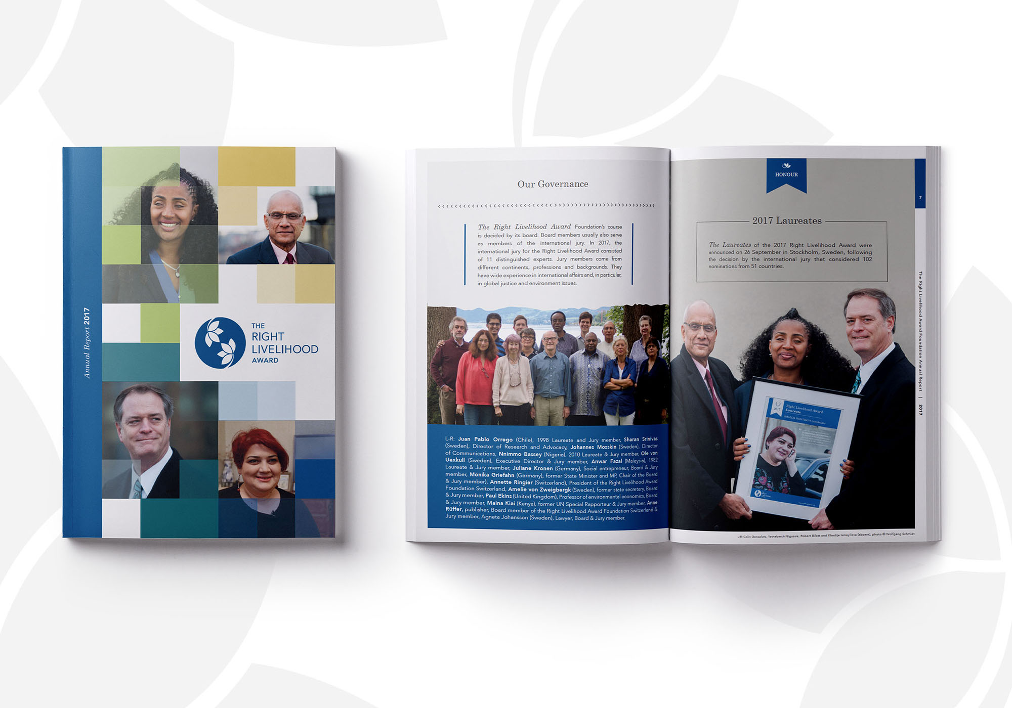
The foundation was in need of a brand overhaul and communications strategy to engage with a global audience. The vision was to highlight their mission statement: honour, support, educate and inform through captivating imagery and thoughtful design.
The project included extensive research into creating a meaningful concept that honours the previous branding, history and future goals. The rebrand consisted of moodboard creation, logo design, typography, design language, printed materials and marketing for the annual award ceremony.
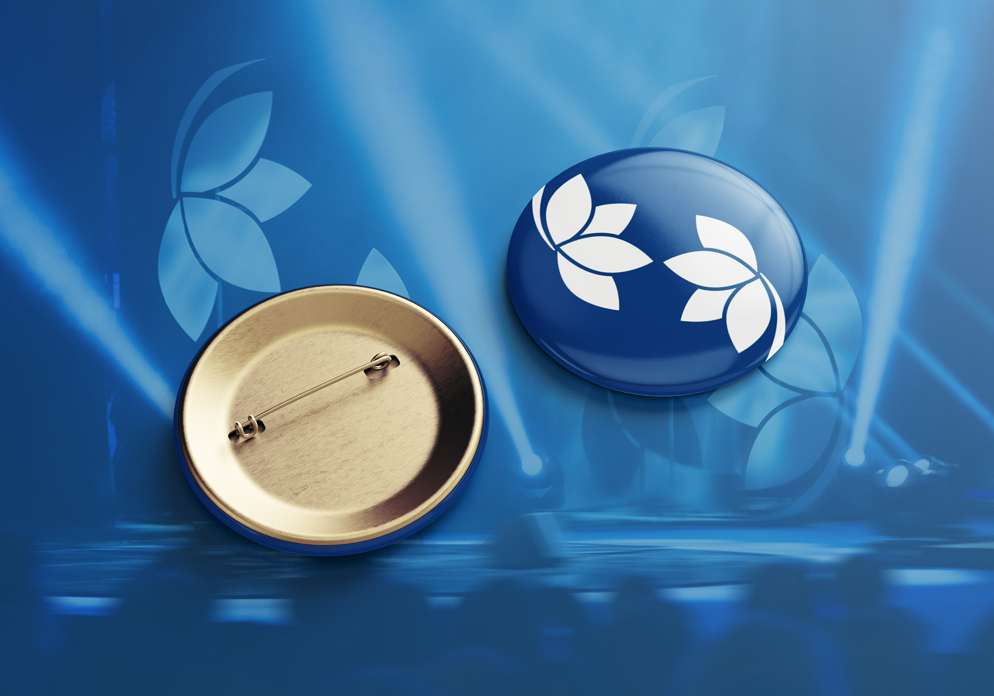
Logo
Symbolism.
Roundel – symbolising the world and “wholeness”.
Yin and Yang – representing opposite forces interconnecting in the natural world.
Flowers – simplified to represent the lotus flower, relating back to Buddhist origins of the “Right Livelihood” name – the traditional Buddhist teaching of the Eight-Fold Path to Enlightenment that focuses on ethical and honest work.
Four petals on each flower symbolise the foundation’s mission statement – Honour, Support, Educate and Inform while the other four petals symbolise the four core values – Courageous, Committed, Action-oriented and Visionary. The two flowers were changed to face inwards, symbolising connection.
Infinity symbol – This subtle addition is made by the two touching petals, and signifies the endless work and vision of a just, peaceful and sustainable world.
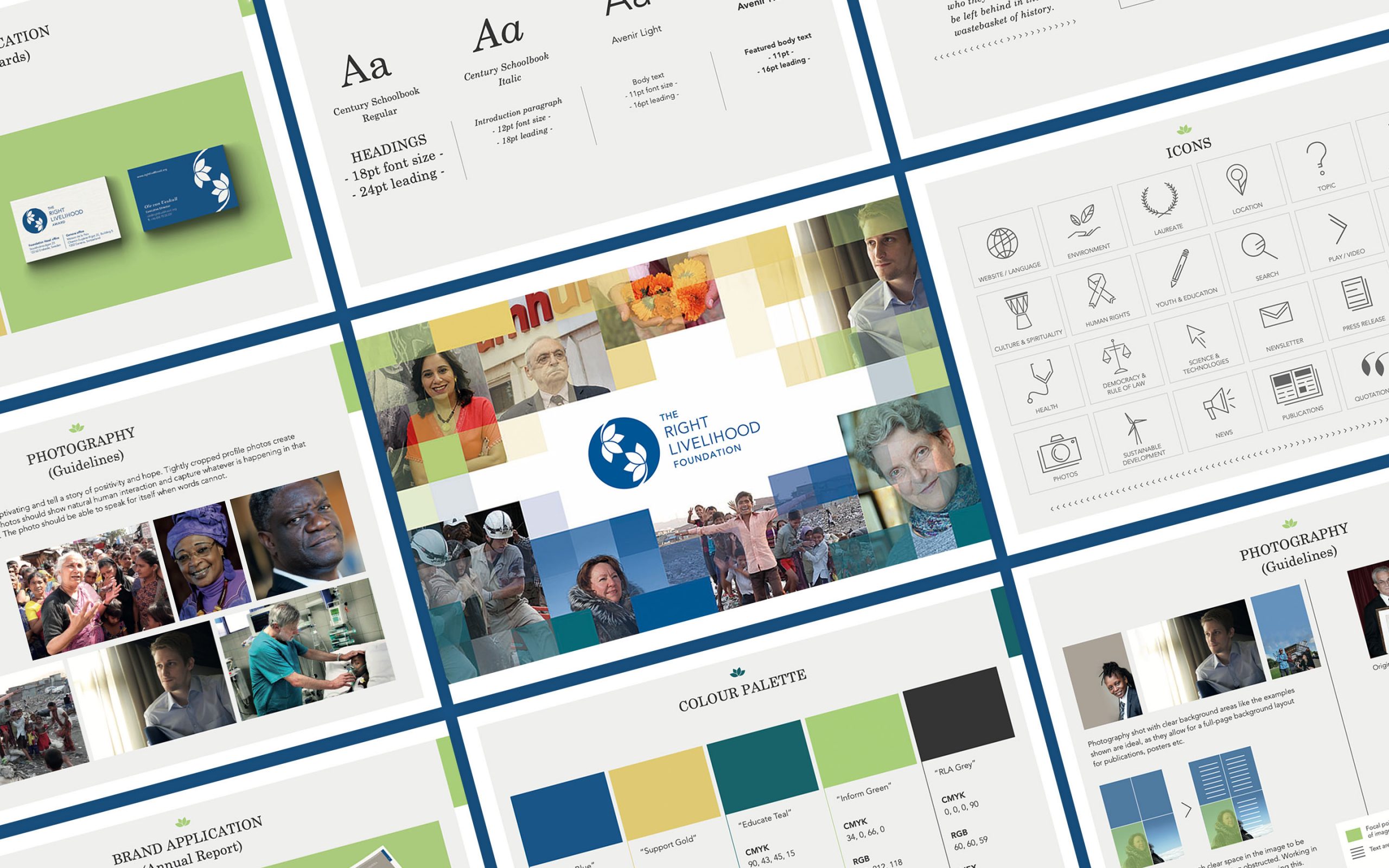
Brand
Guidelines.
The refreshed brand included a light, positive and nature-inspired colour palette for each area: “Honour, Support, Educate, Inform”.
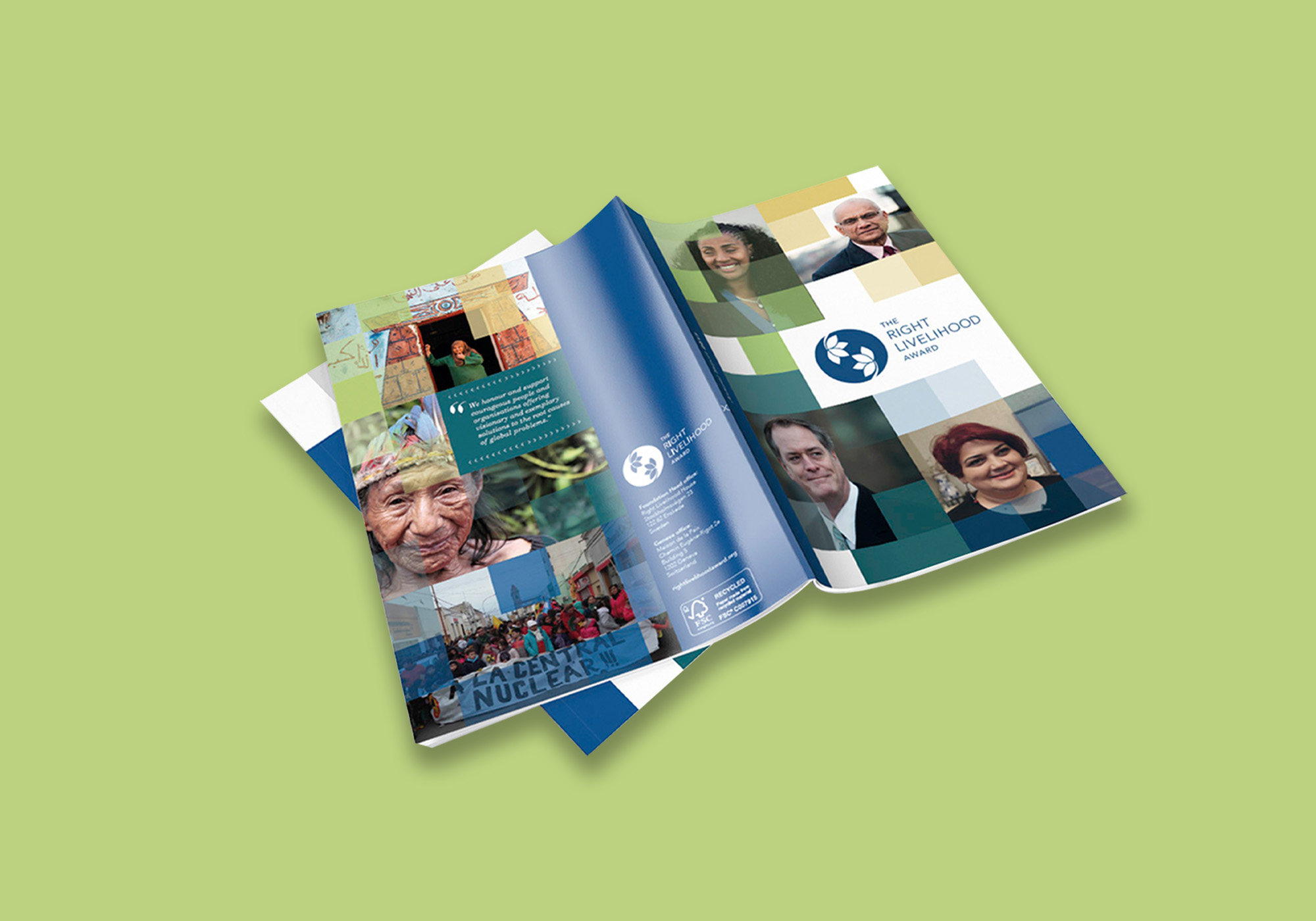
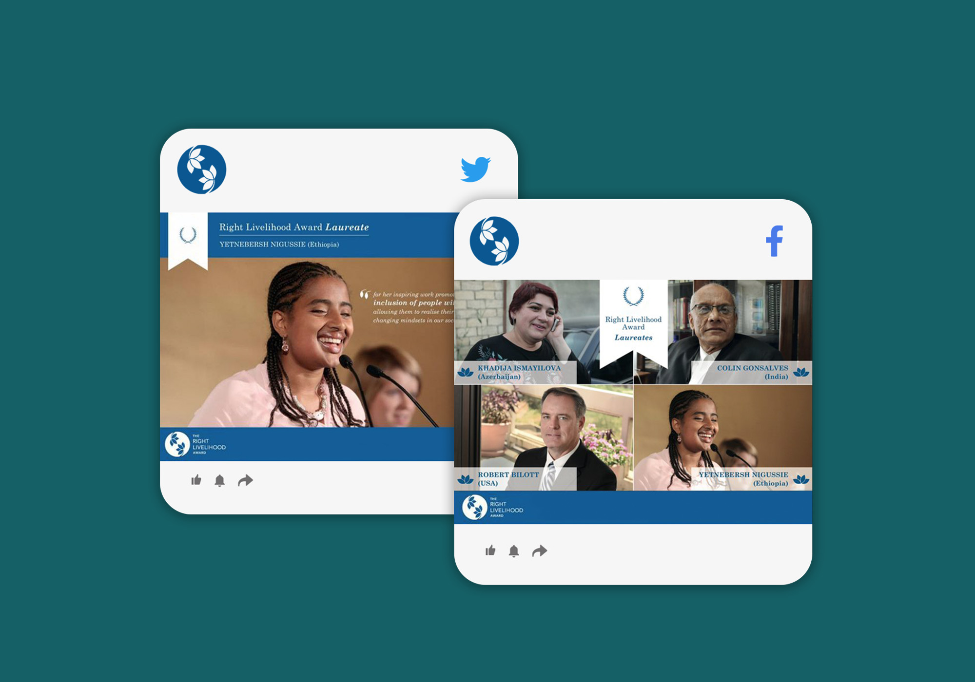
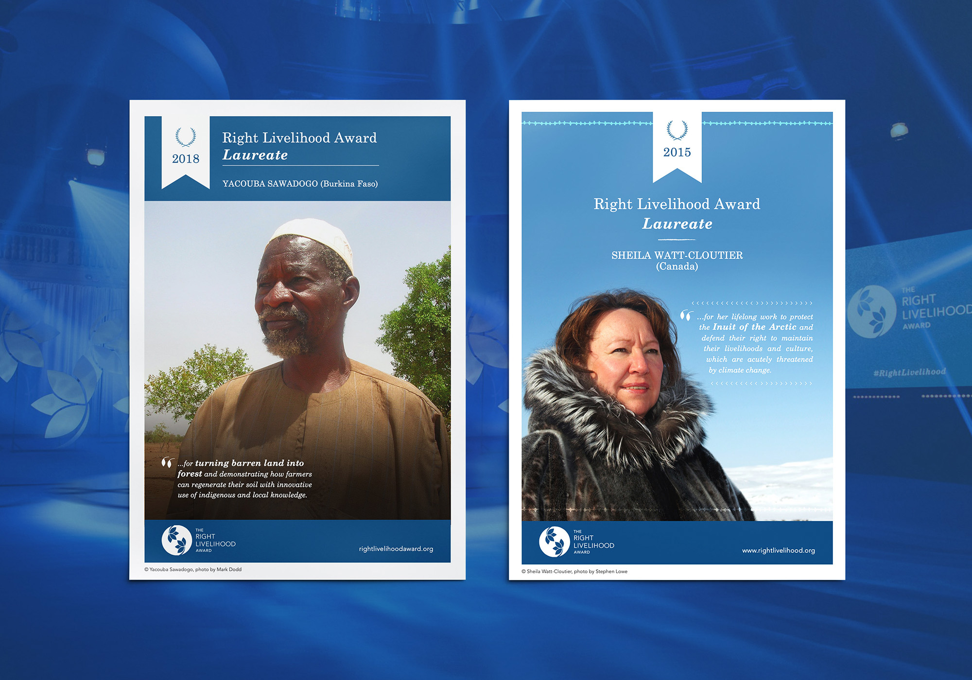
Brand Application.
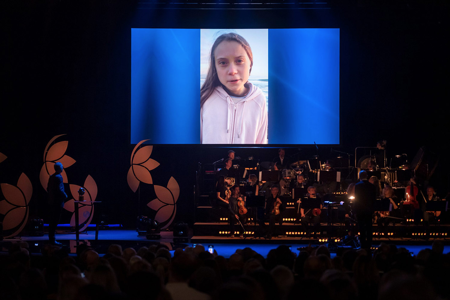
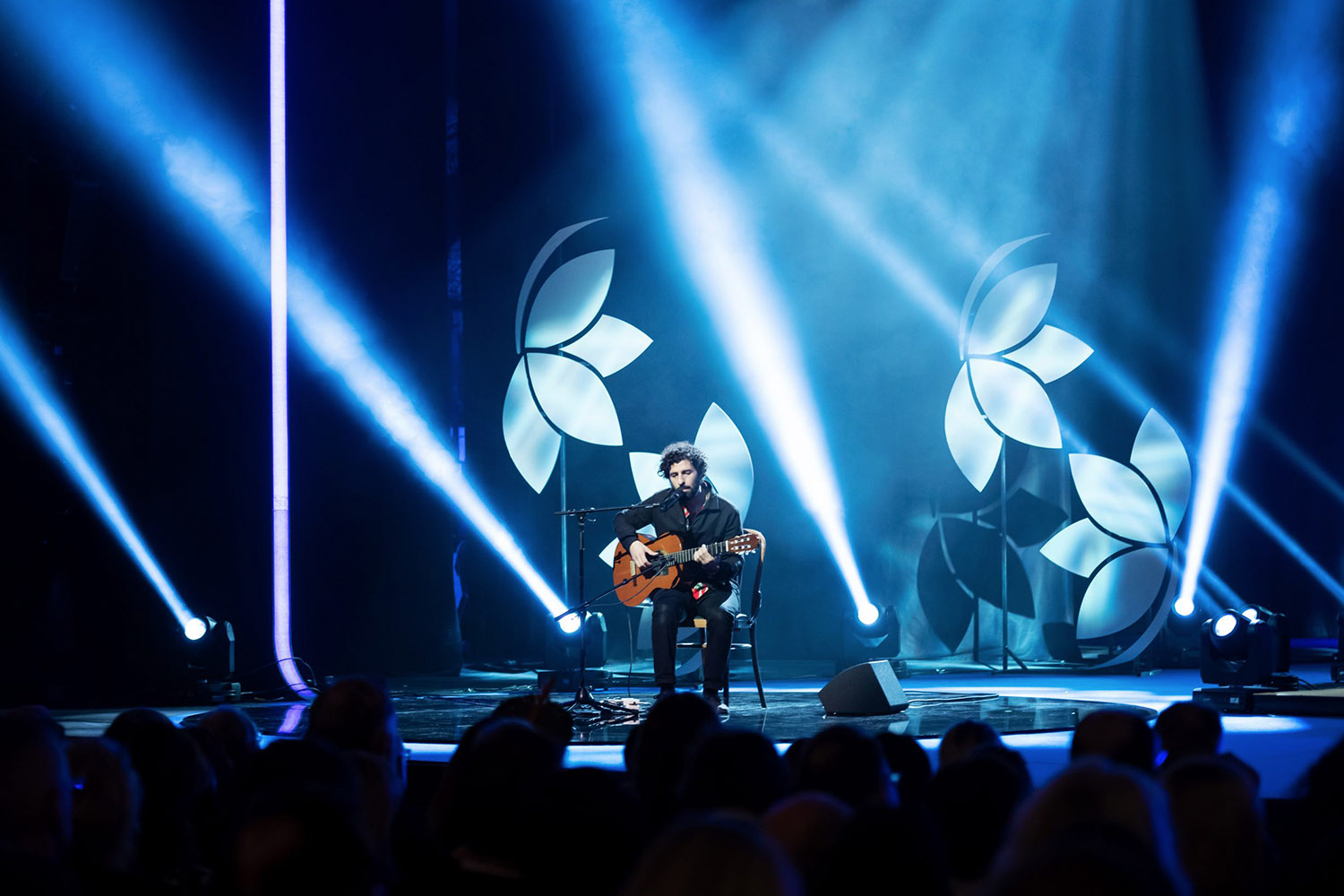
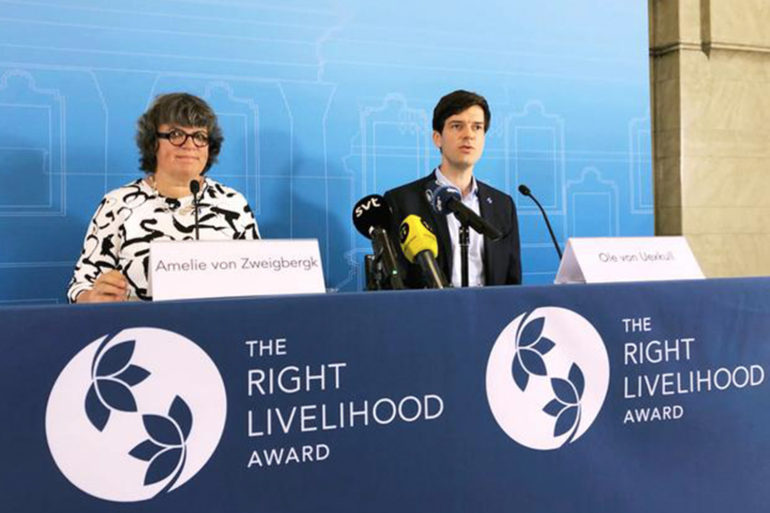
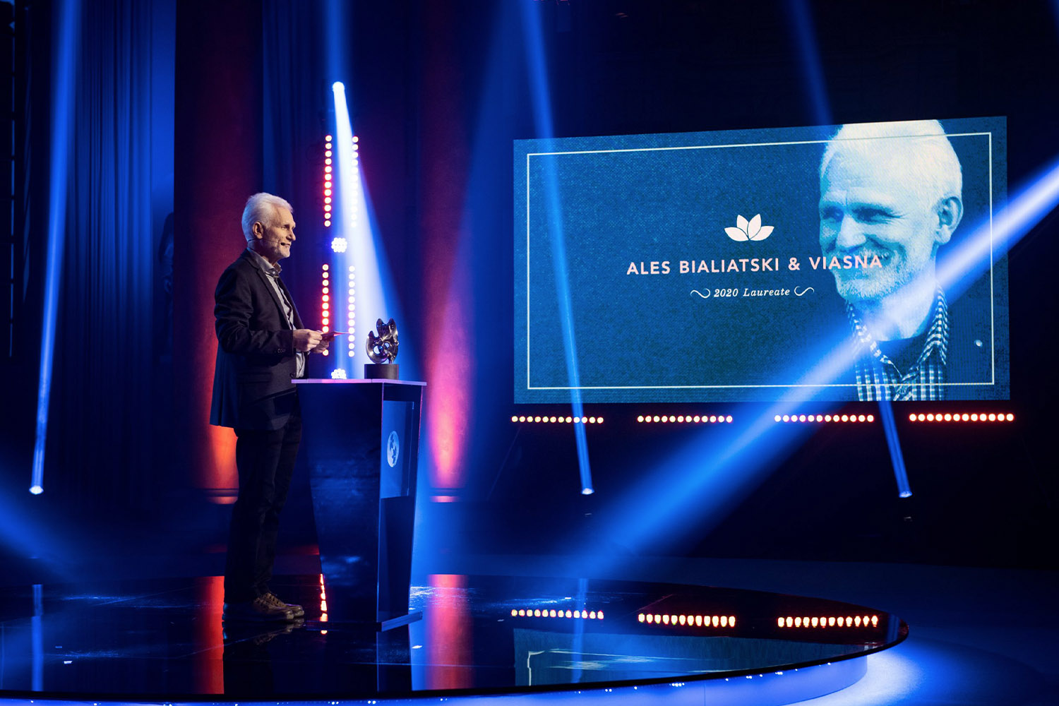
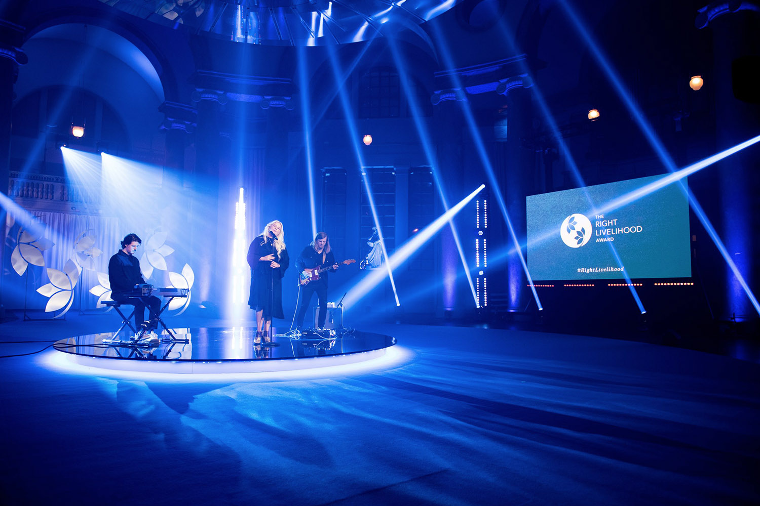
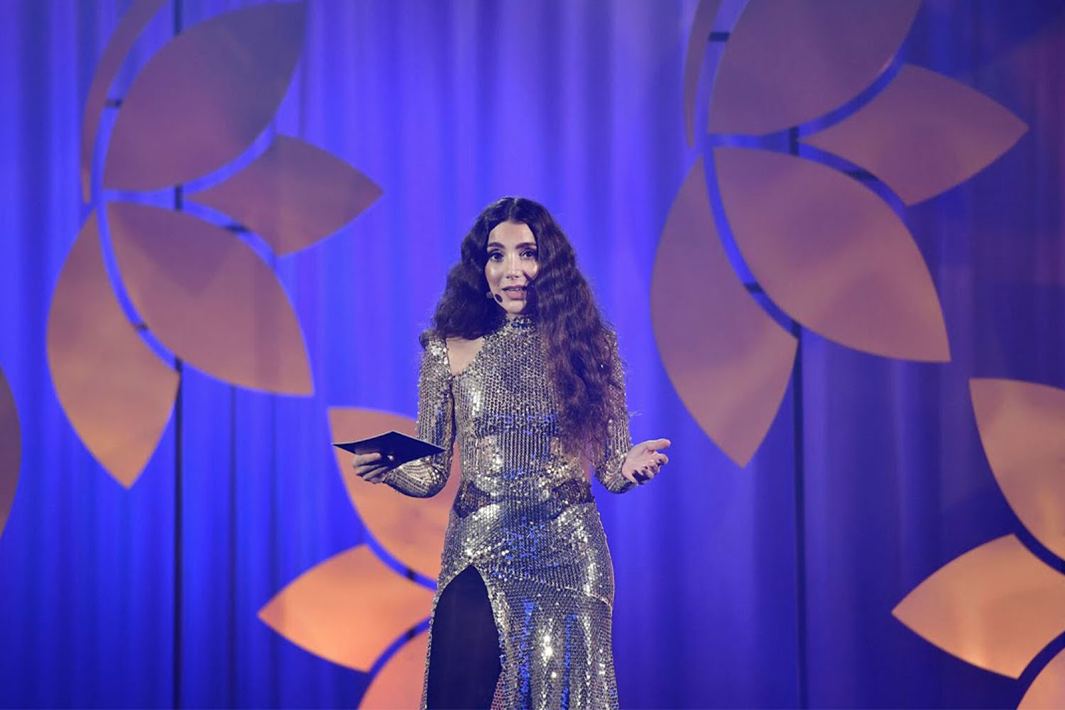
Award Ceremony
Photo credits: RLA