
CASE STUDY
VISUAL REFRESH & WEB DESIGN FOR FAMILY LAW FIRM
About the
project.
-
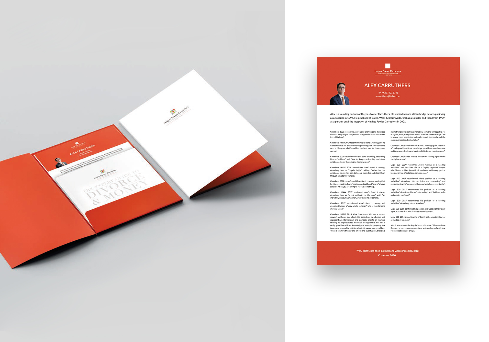
DELIVERABLESVisual identity refresh, web design, events & digital marketing, social media assets, brochure design.
-
YEAR2020
OVERVIEW
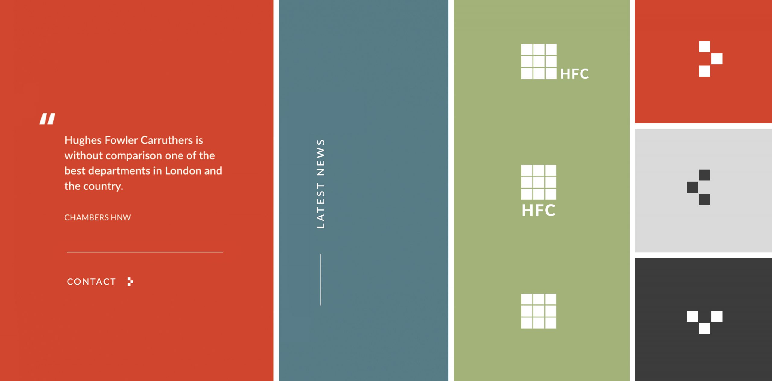
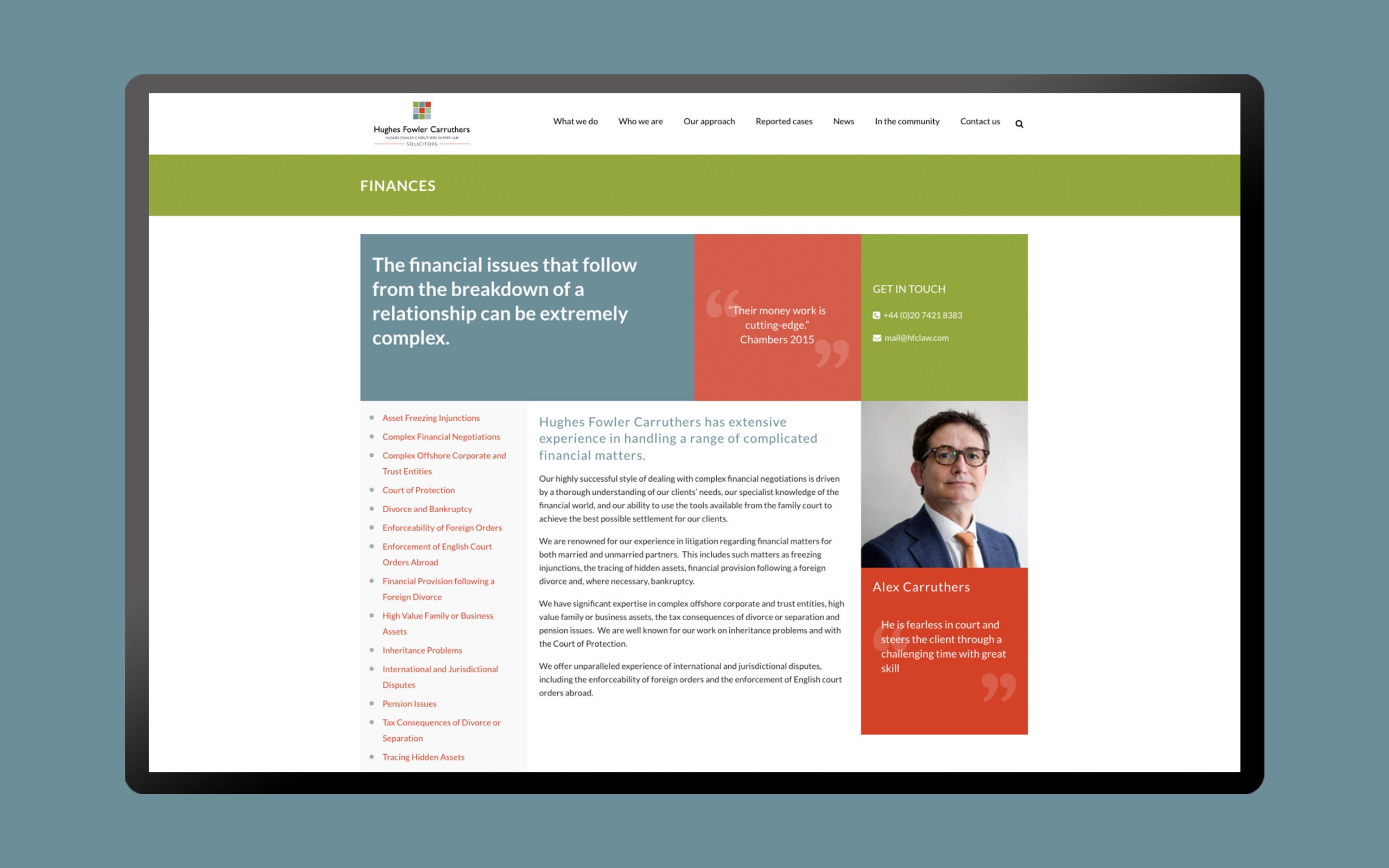
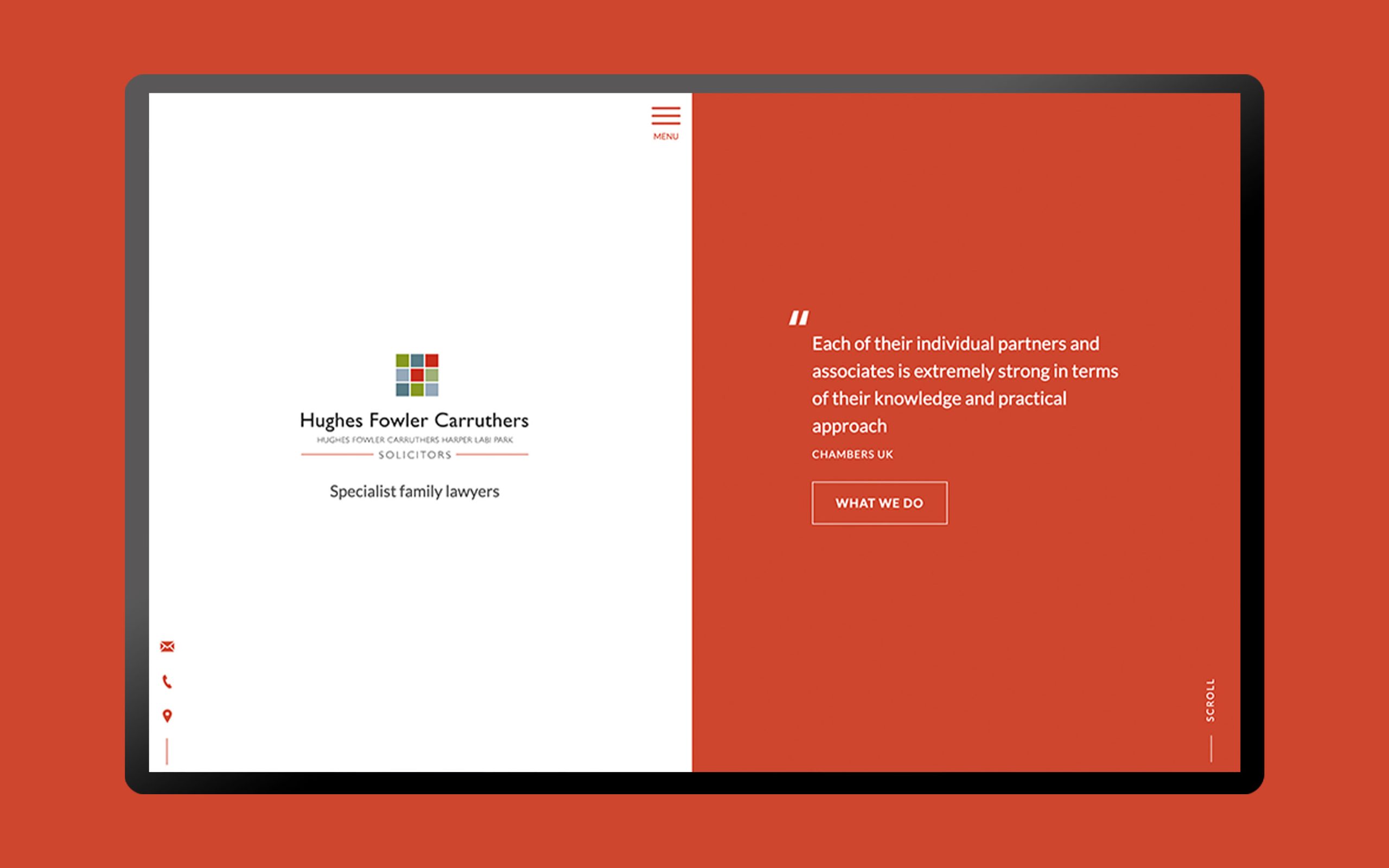
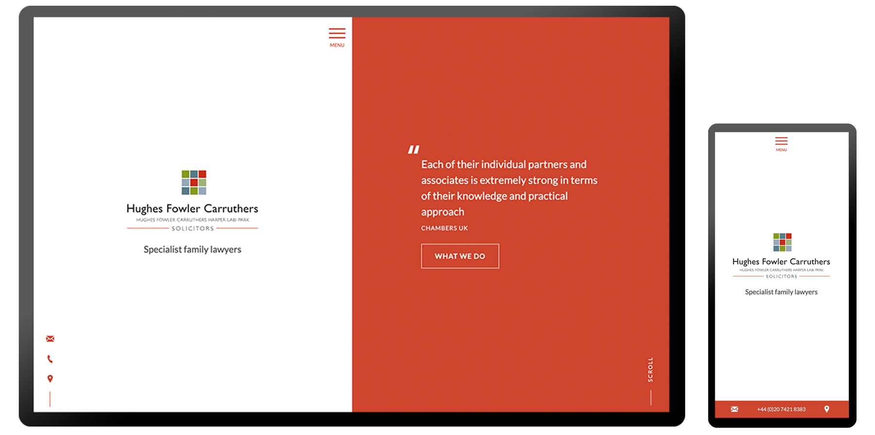
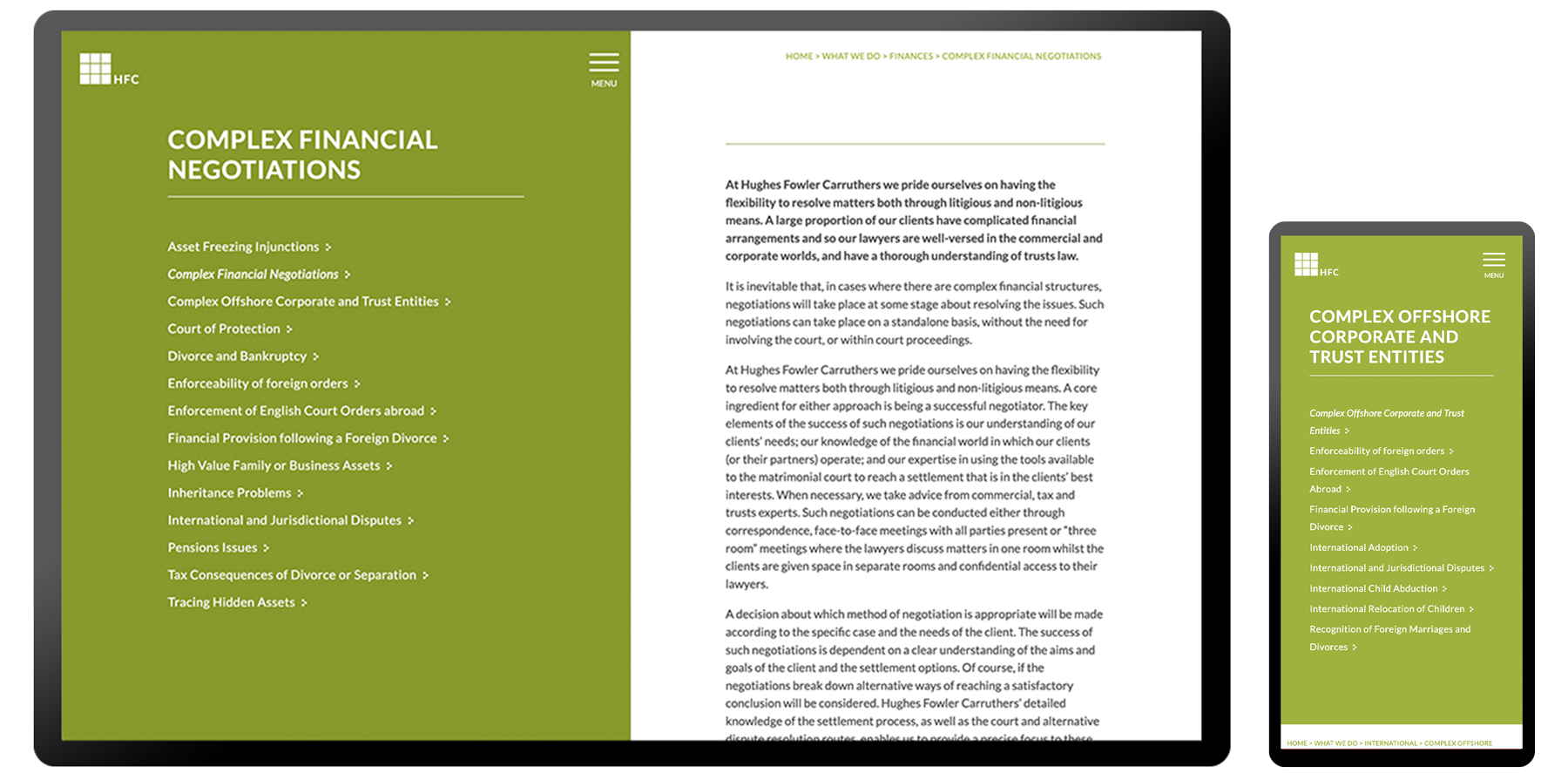
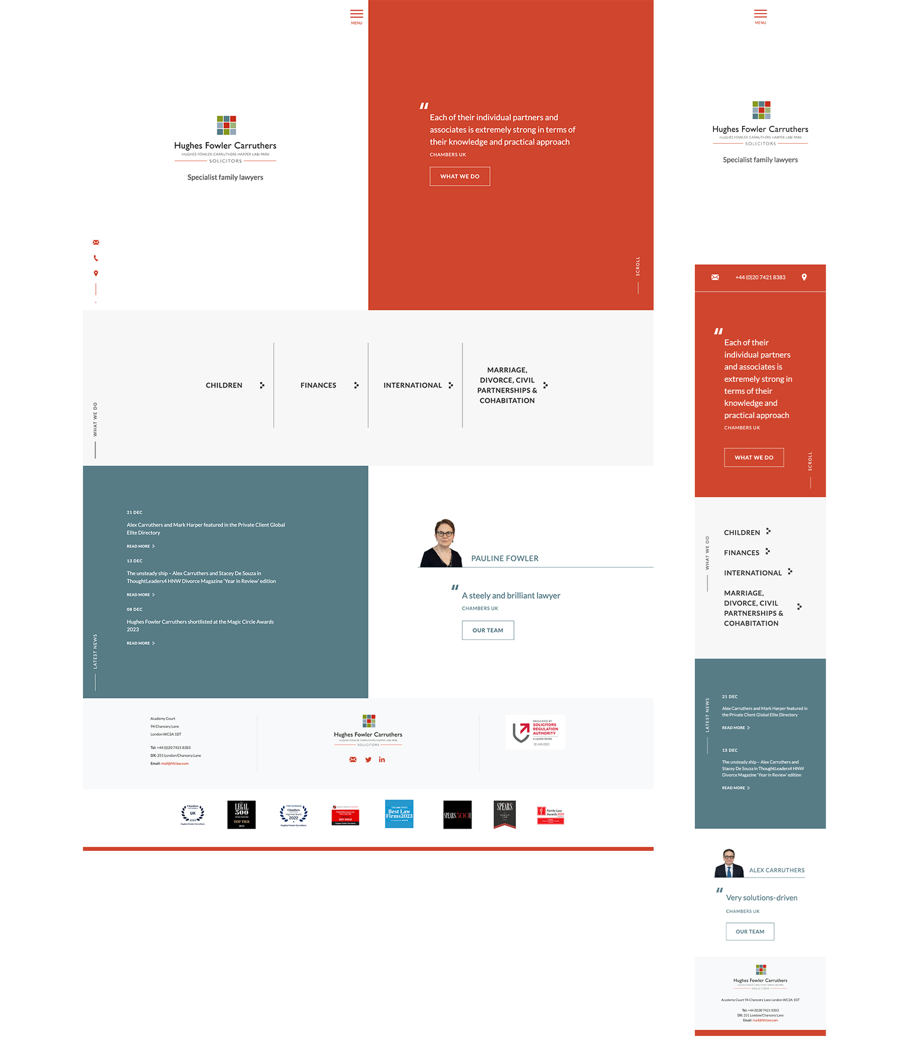
The client required a unique, statement website to tie in with their colourful, bold brand. I was responsible for creating an updated visual style and design language using their existing colours and logo. The strategy was to take a minimal, typographic approach and rethink how their colour palette should be used.
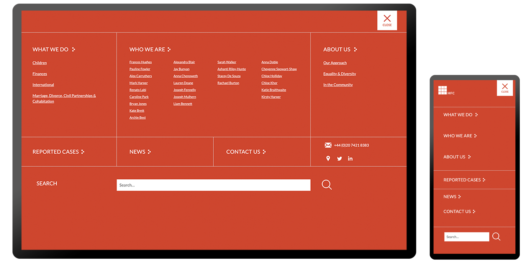
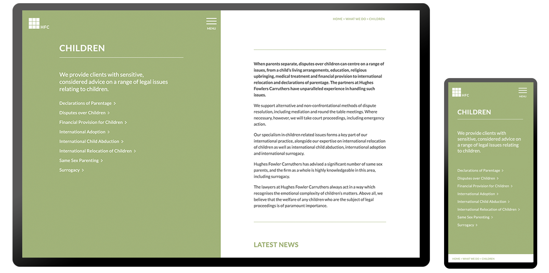
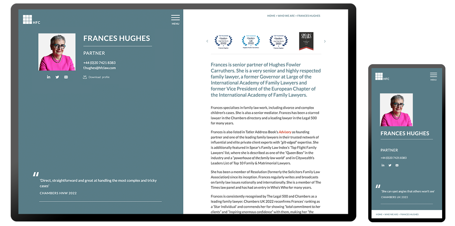
This included assigning key areas of the firm to each of the swatches to create better visual impact and hierarchy. Design assets were created using graphic elements of their logo and a split-screen or block colour style was used for web application and other branded materials.
Design
Language.
- Typography + page furniture
- Responsive logo design
- Quote styles
- Button design based on logo shapes
Website
Design.
SWIPE FOR MORE
Prototype
Development.
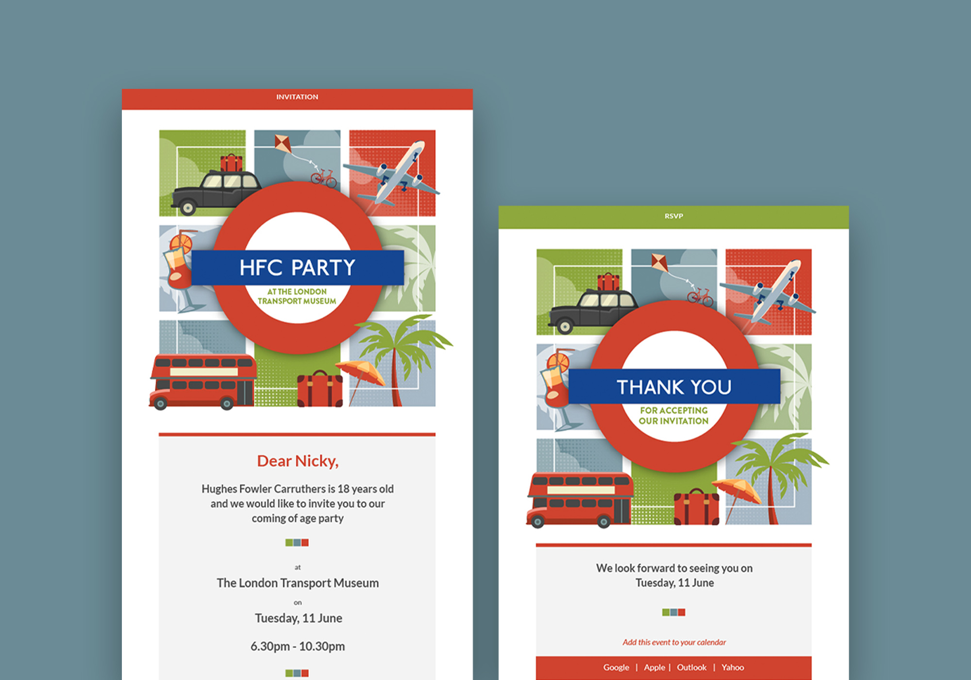
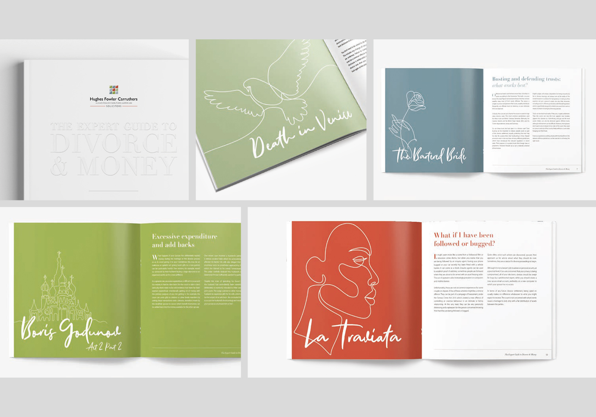
Marketing
& Promotional.
- Digital invitation design
- Marketing brochures + booklets
- Branded stationery