CASE STUDY
BRANDING & WEB DESIGN FOR RENEWABLE ENERGY RESOURCE PROVIDER
About the
project.
-
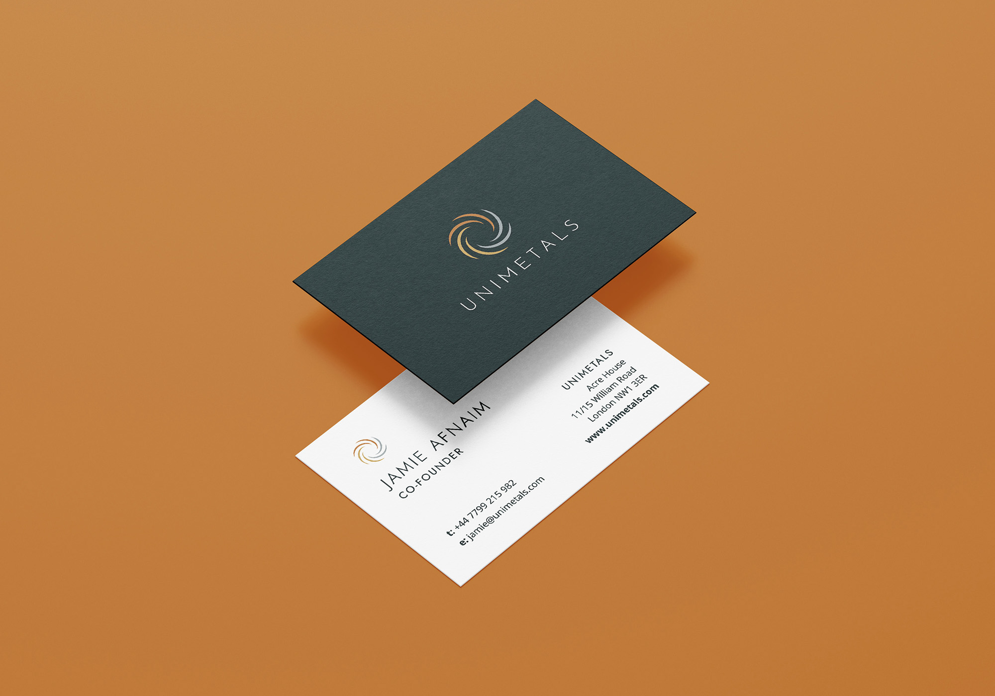
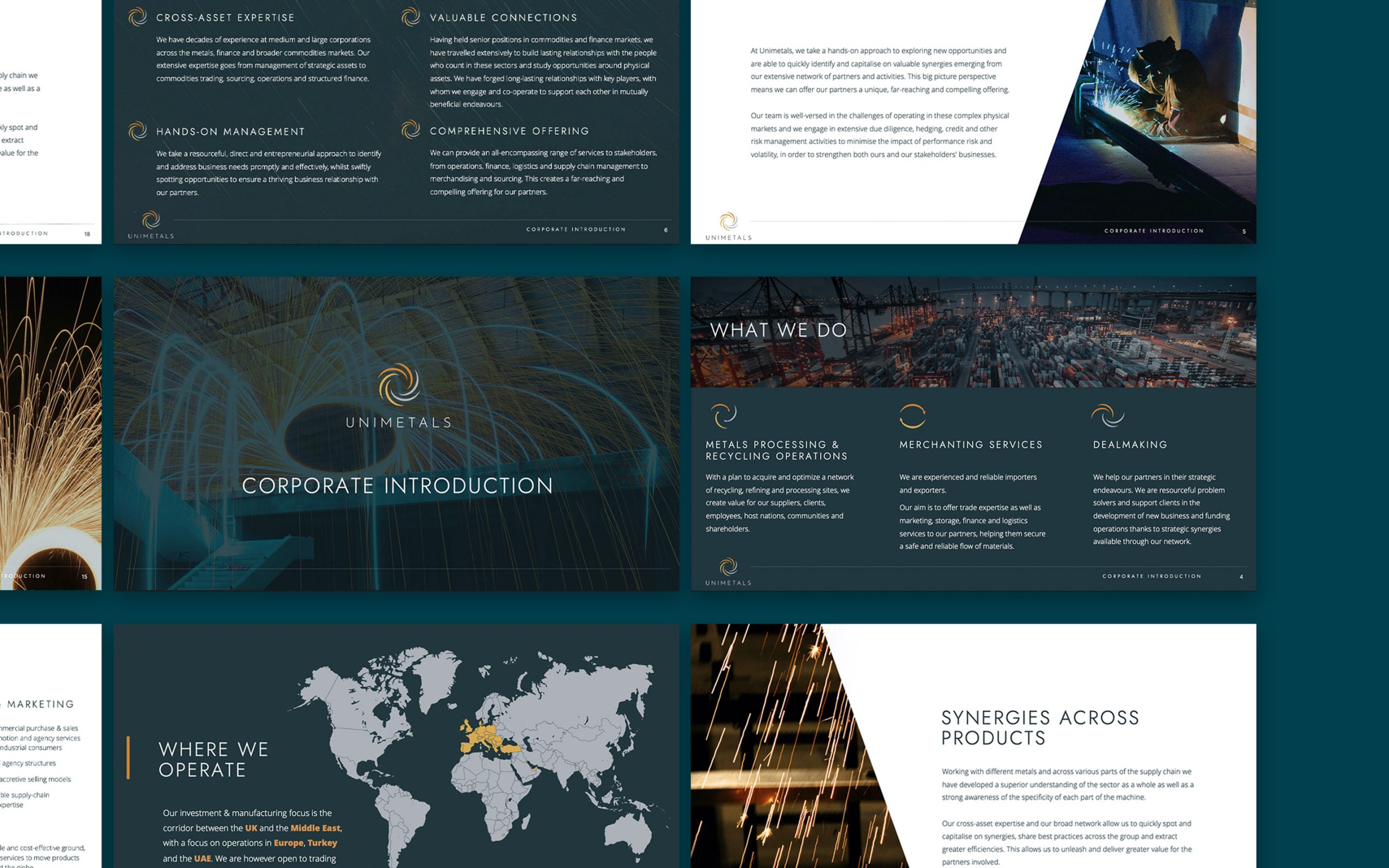
DELIVERABLESBranding, web design, infographics, stationery, presentation design.
-
YEAR2022
OVERVIEW
The client required a new visual identity, marketing materials and business deck to elevate their company image.
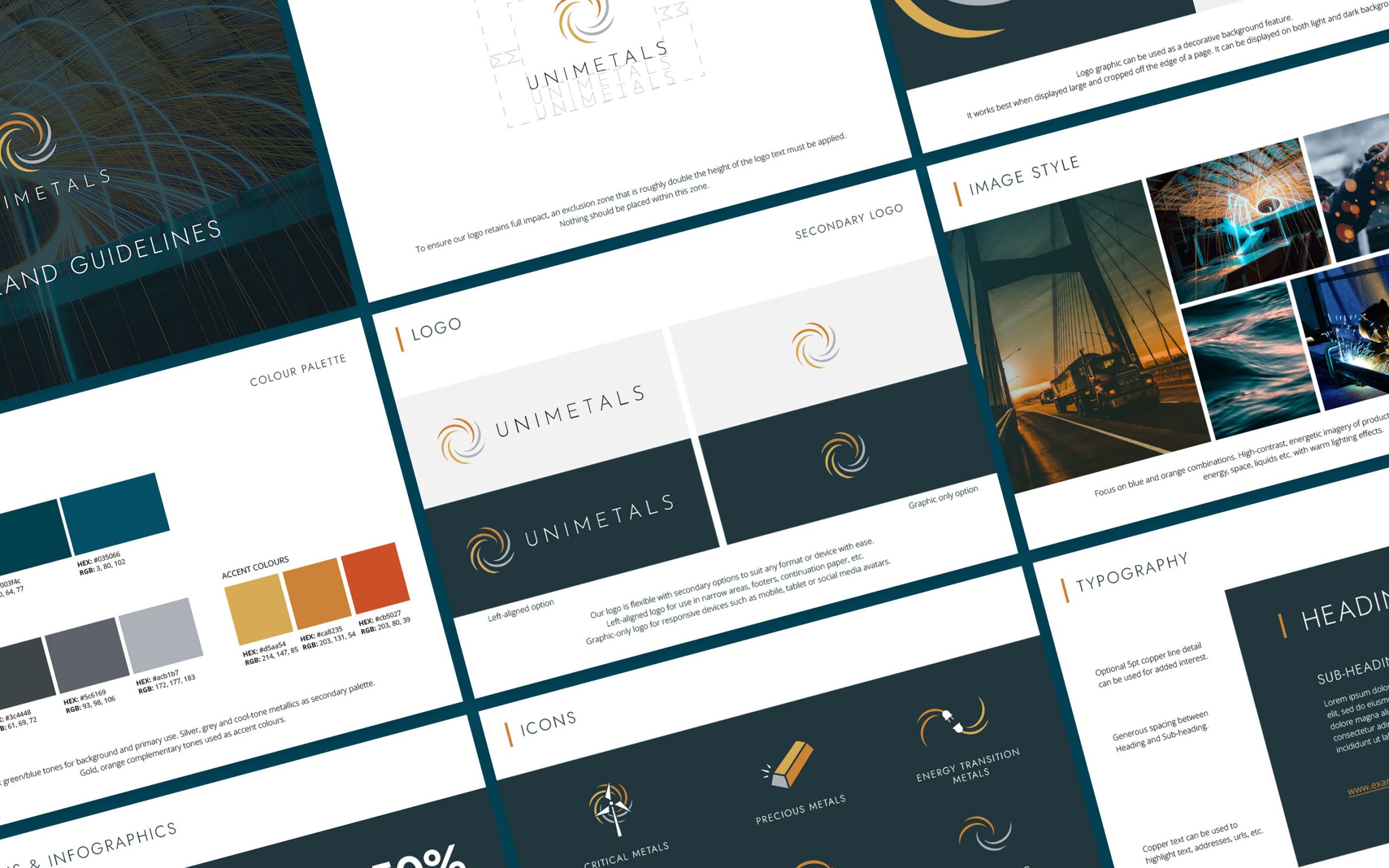
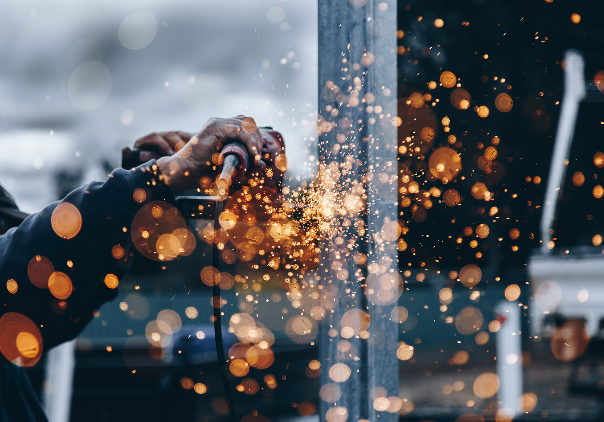
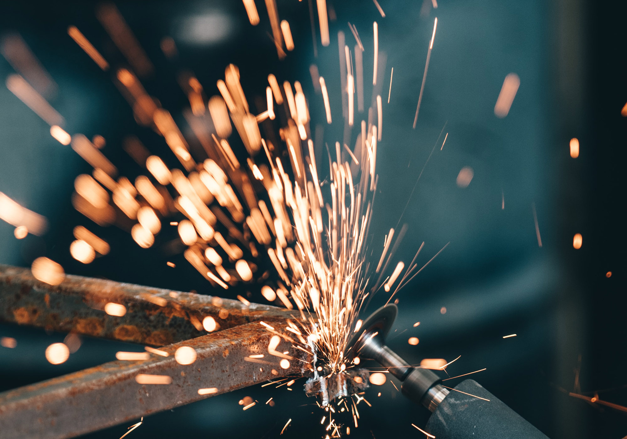
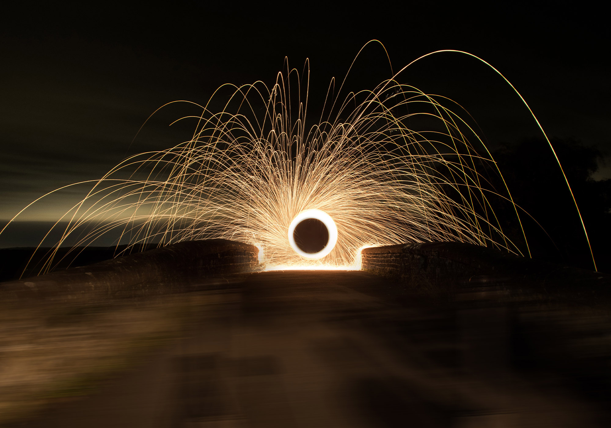
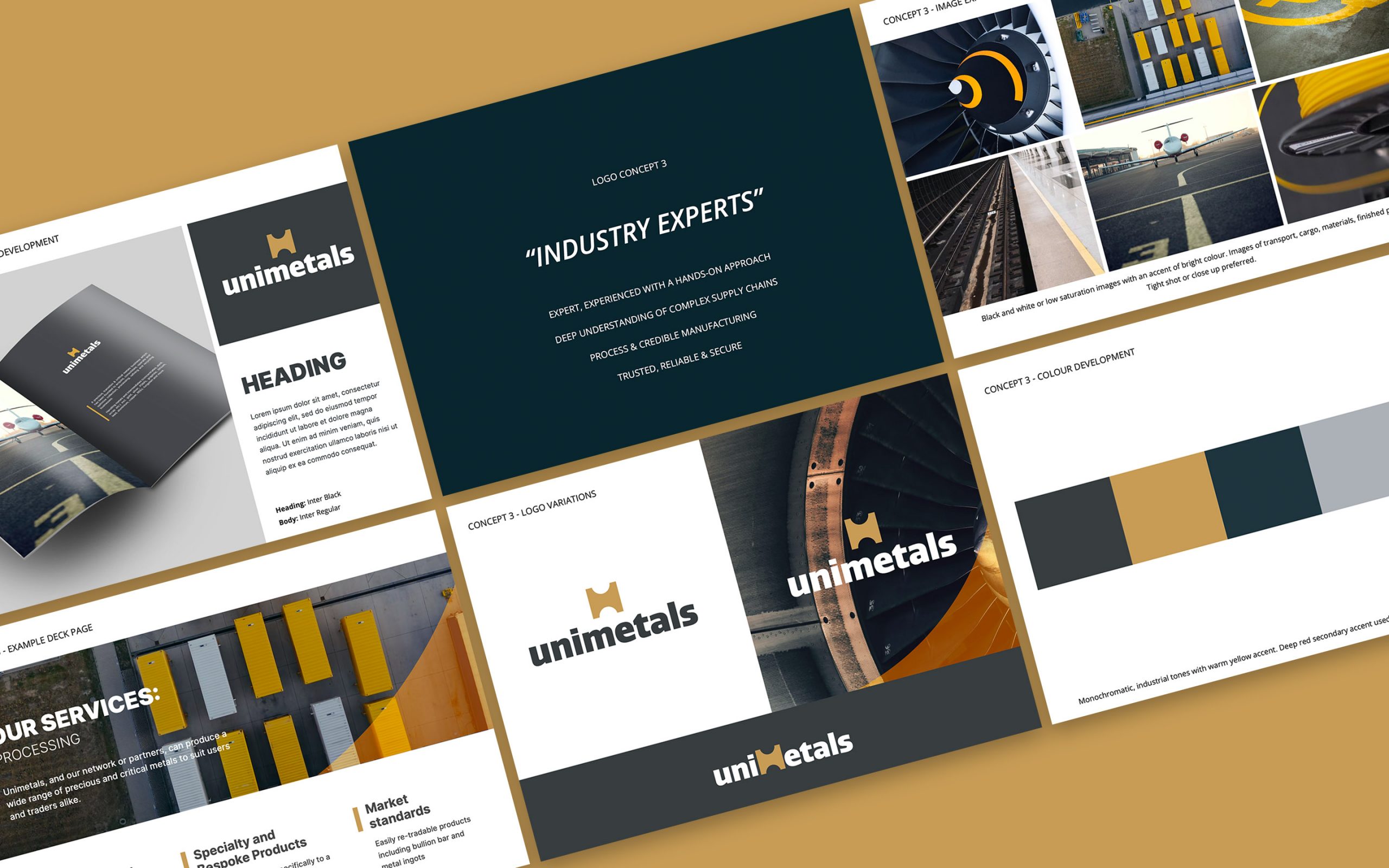
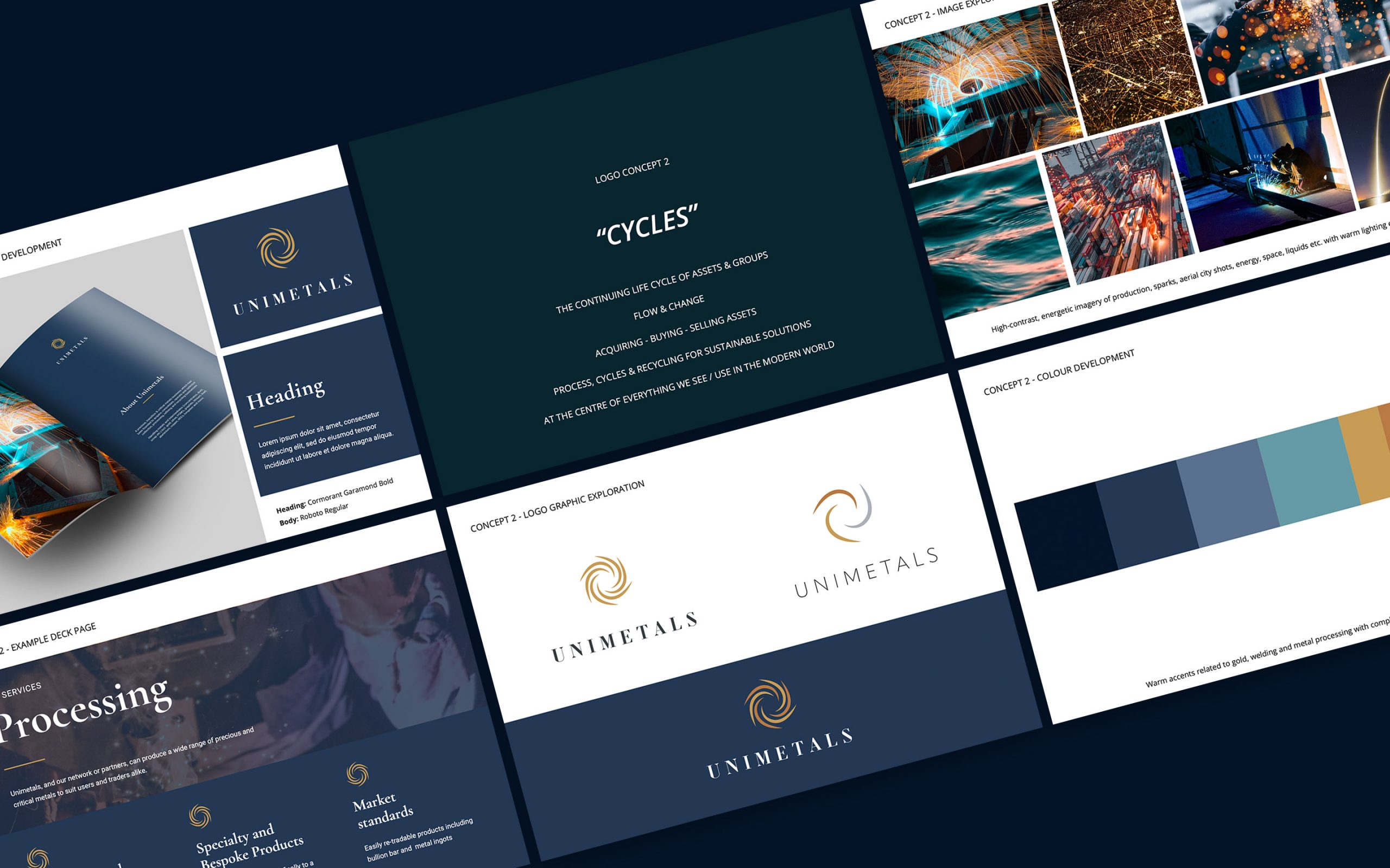
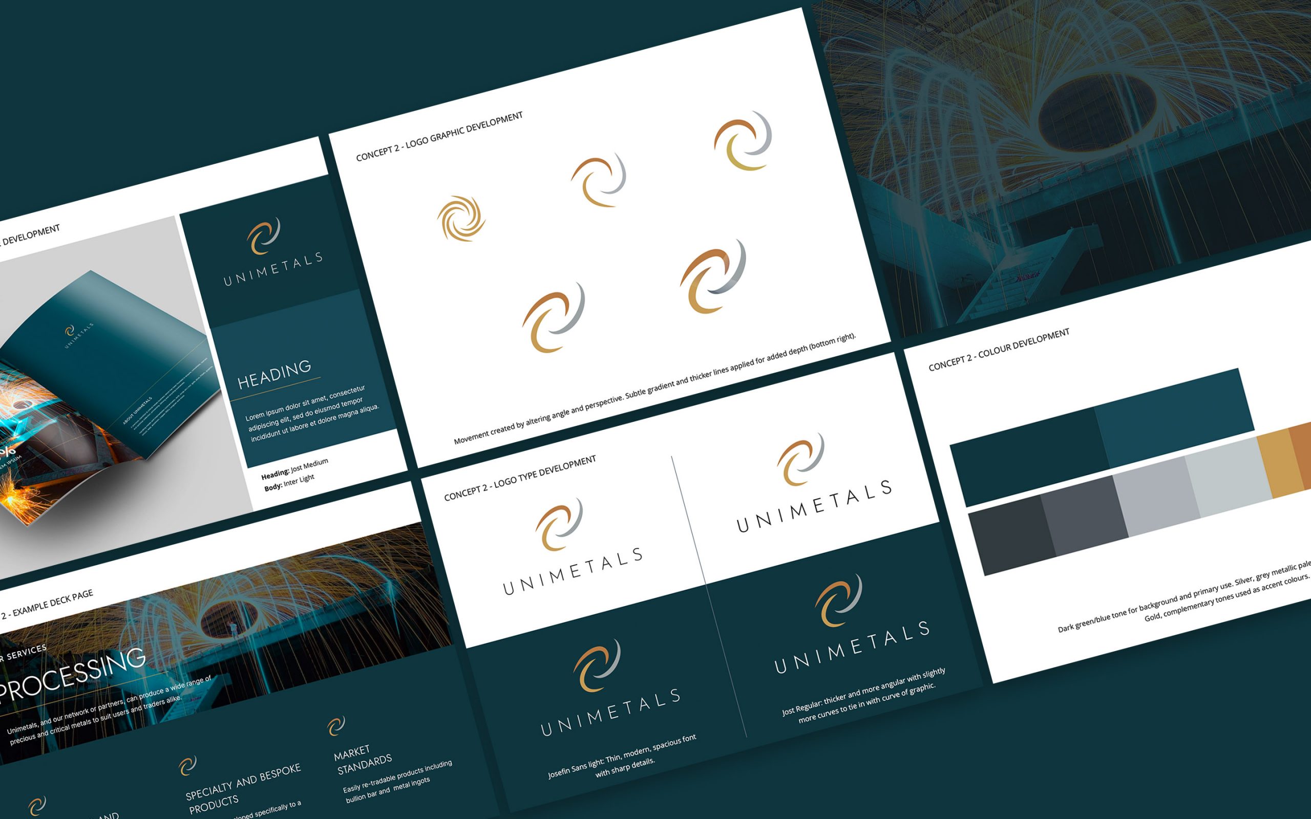
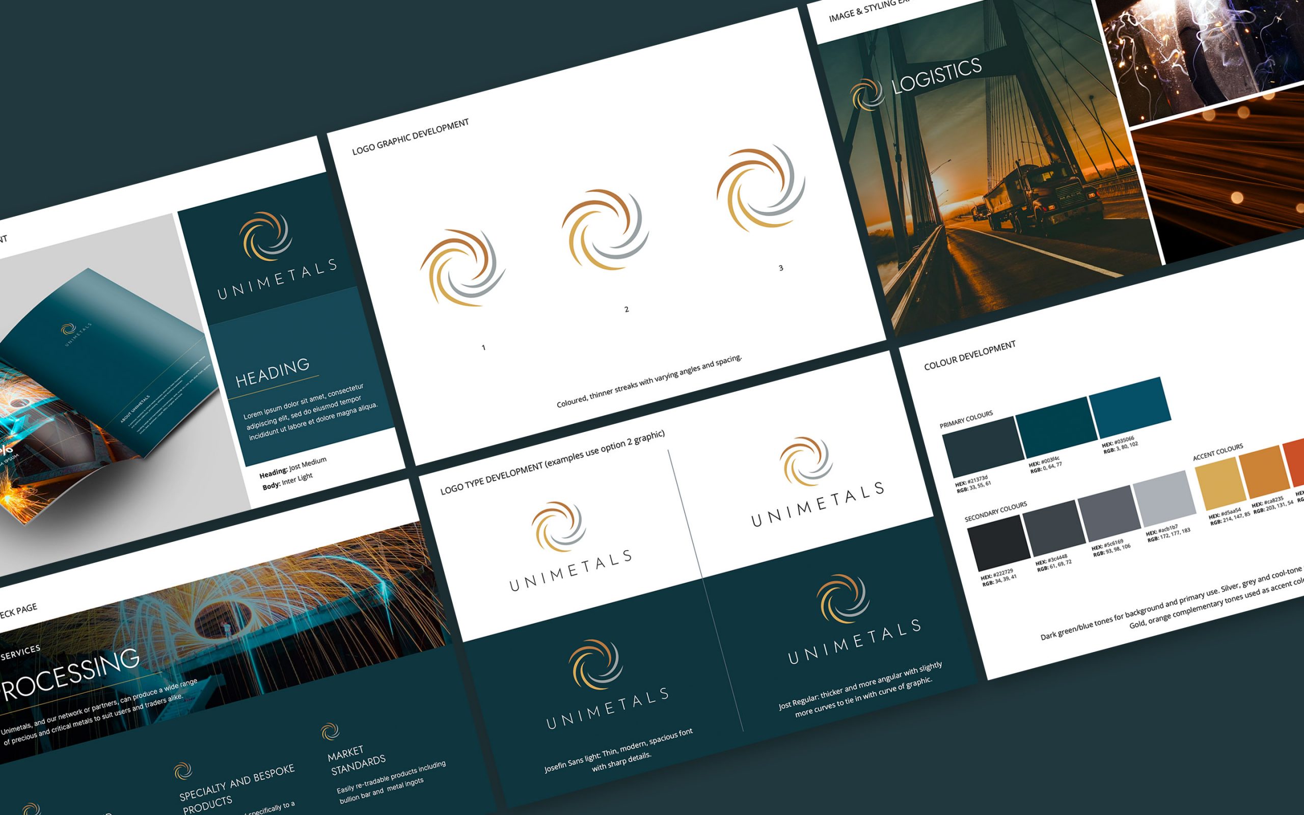
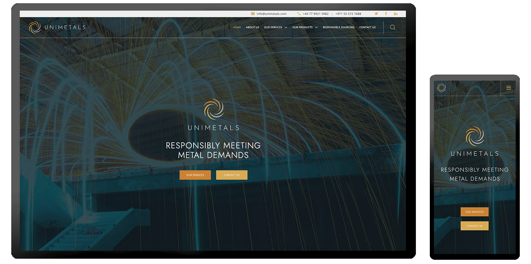
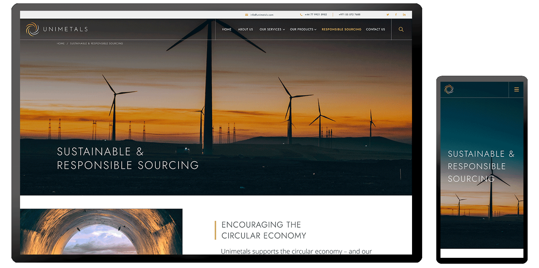
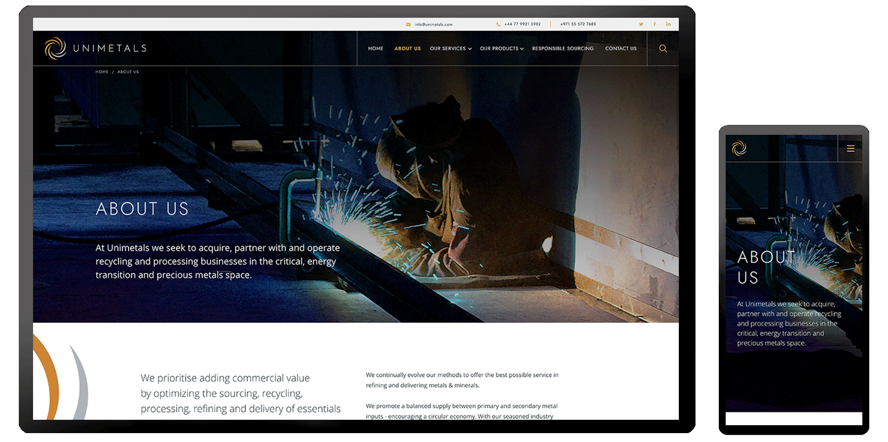
Representing “cycles”, the logo is symbolic of the continuing life cycle of the renewable energy industry, flow and change, processes and recycling for sustainable solutions.
The graphic takes literal elements of metal processing imagery to create a circular focus with a nod to renewable resources being central to everything we see and use in the modern world.
The colour palette was inspired by industrial metallic tones, balanced with warm golds and orange hues. The project included a full rebrand, business deck, marketing materials, stationery and a new website.
Brand
Guidelines.
Presentation
Design.


Brand
Development.
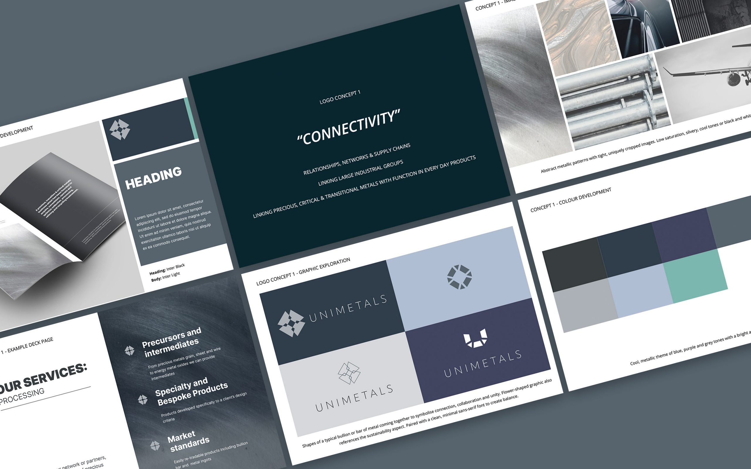
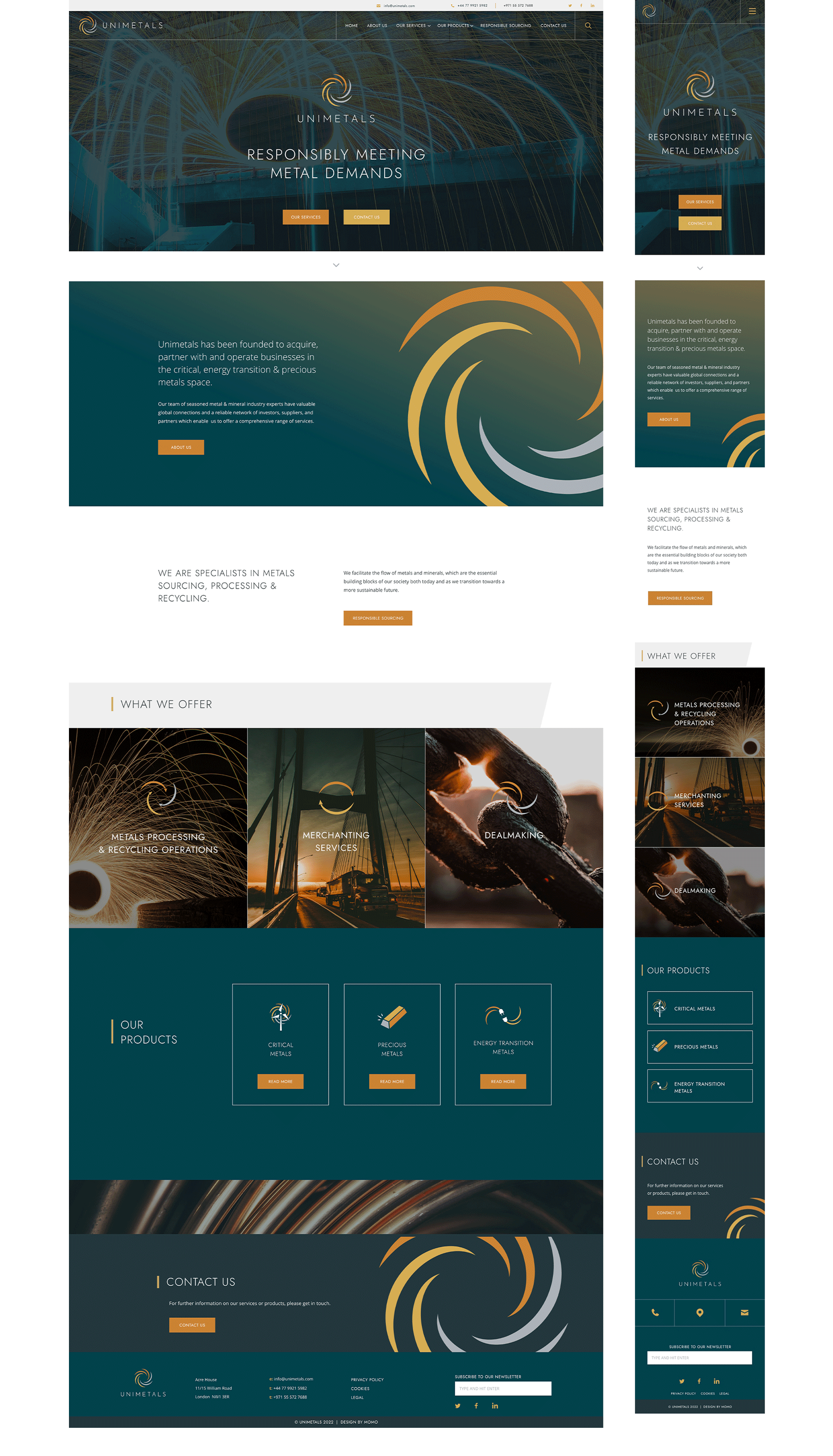
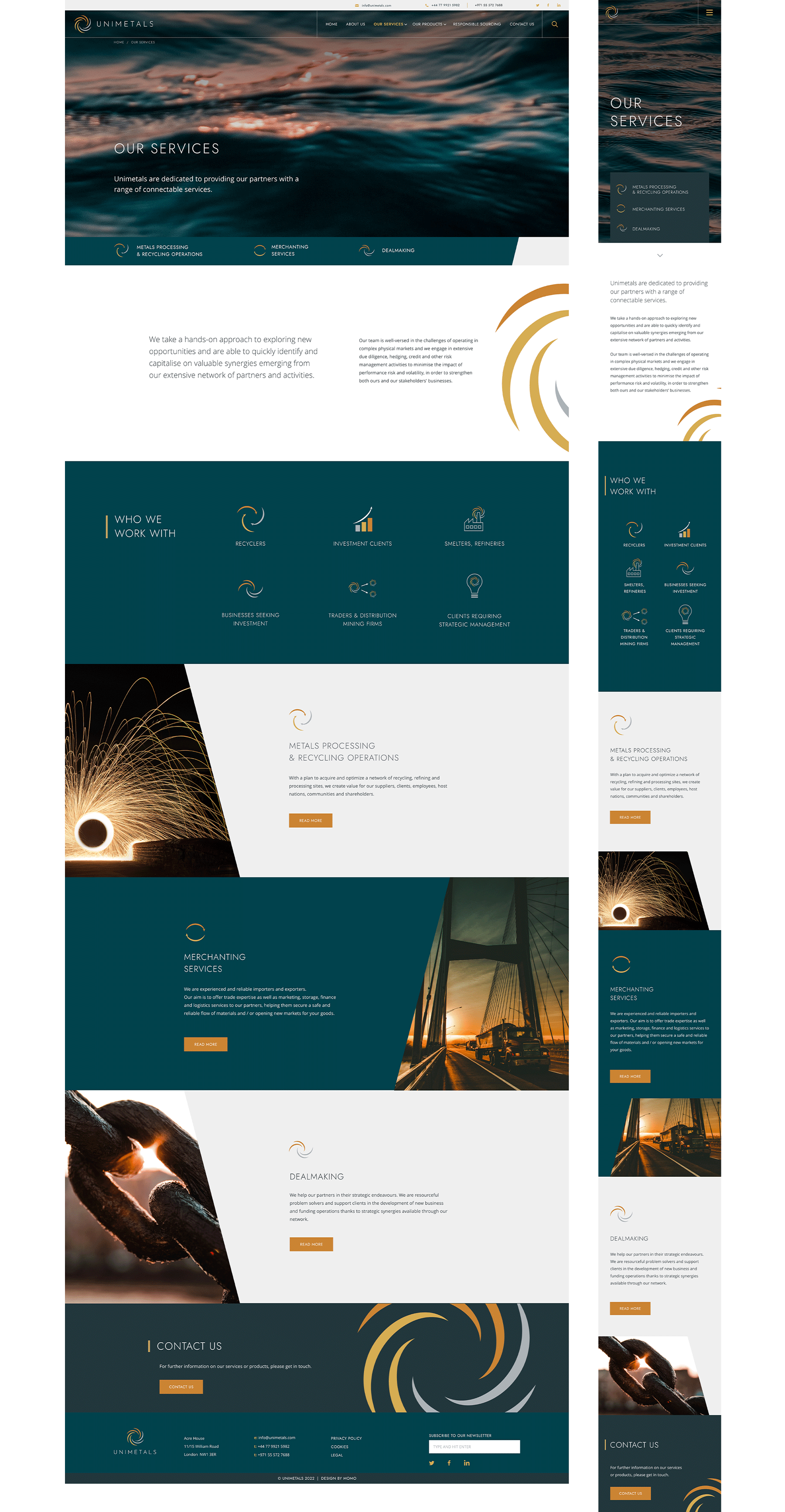
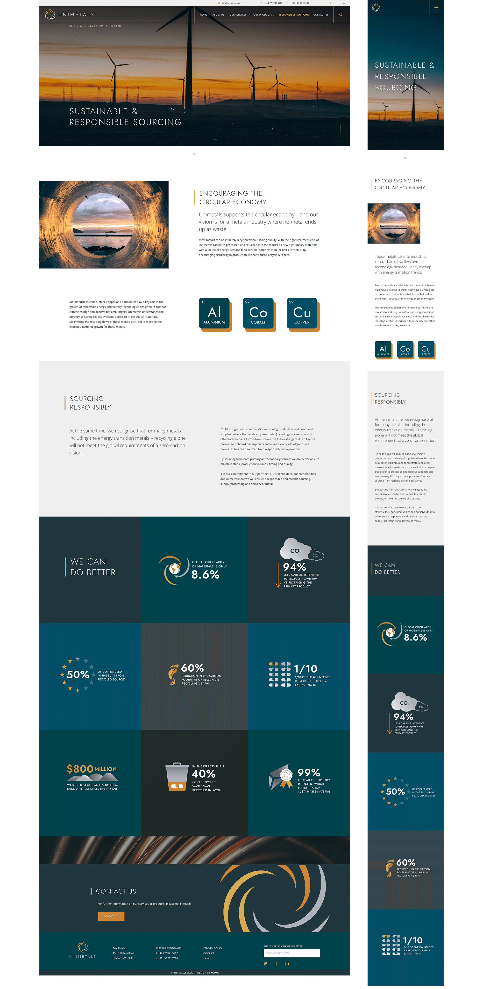
Website Design.
SWIPE FOR MORE
Prototype
Development.
SWIPE FOR MORE